
Ember & Oak
A restaurant site built for someone standing on the pavement outside
- Typical build
- 1–2 weeks
- Plan
- Starter / Business Website
- Sector
- Hospitality
Ember & Oak is a demonstration build. The business is invented, which is exactly why we can show you every page and explain every decision. It is built and deployed to the same standard as client work — open the live demo and click through it.
The brief
Ember & Oak is a demonstration build for a wood-fired shared-plates restaurant in Chicago’s Fulton Market. Restaurant websites have the shortest patience budget of anything we build — most visits are on a phone, within an hour of the meal, by someone deciding between you and two other places.
Three people, three different jobs
Almost every failed site in this sector fails by treating these visitors as one audience.
The deciding diner
Are you open, what is the food like, can I get a table tonight. If they cannot tell in ten seconds they book somewhere else.
The occasion booker
A birthday, an anniversary, a client dinner. They want to see the room and know the private dining options.
The regular
What has changed on the menu, and gift cards around the holidays.
Decisions we made
Every one of these is a choice that could have gone the other way, and a reason it did not.
Hours are on the first screen, in full
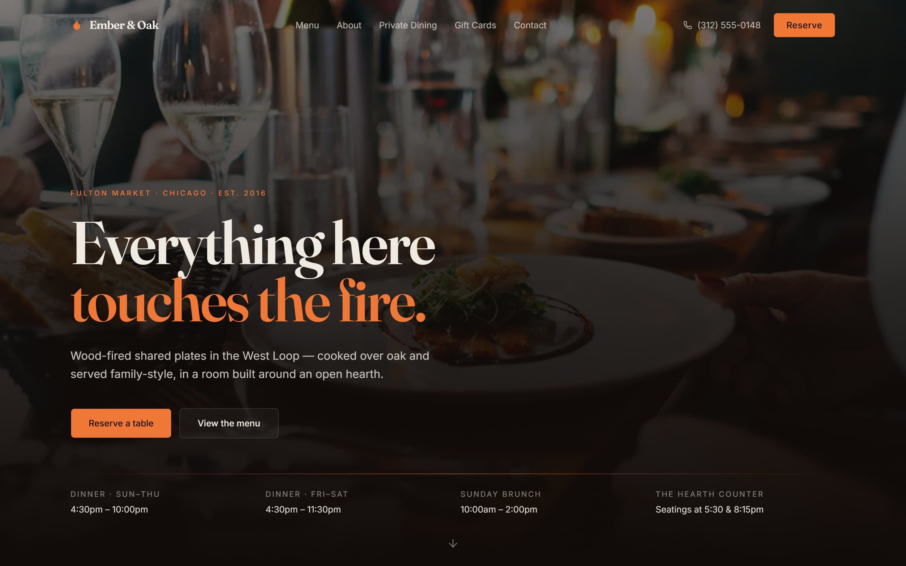
Dinner Sun–Thu, dinner Fri–Sat, Sunday brunch, and the two hearth-counter seatings, all laid out beneath the hero. The single most common reason someone opens a restaurant website is to find out whether it is open, and the single most common failure is making them scroll to the footer for it.
Reserve is permanent and unmissable
A Reserve button sits in the header at every scroll position, with the phone number beside it for the people who would rather call. Booking is the only conversion this site has.
The menu is text on a page, not a PDF
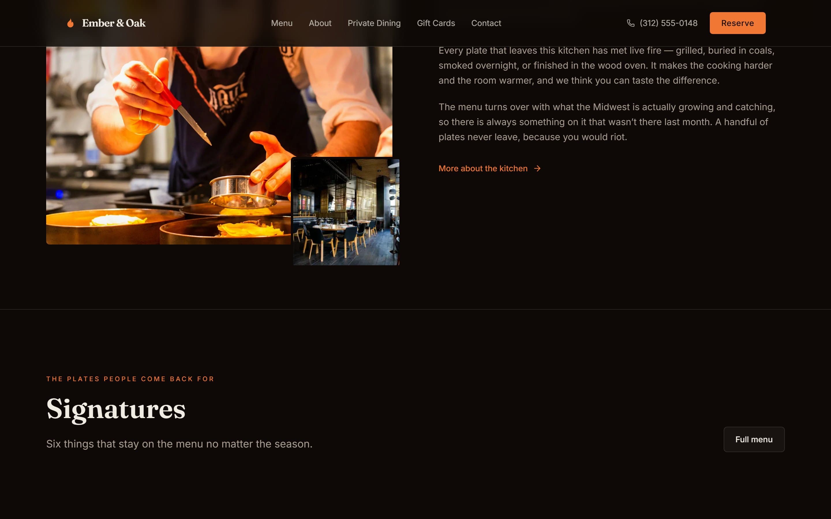
Six signature dishes are laid out with descriptions, plus a wine list. A PDF menu is unreadable on a phone, invisible to Google, and the most common single mistake on restaurant sites.
Press quotes as a moving band, not a testimonials page
Chicago Reader, Bon Appétit, Chicago Tribune and a James Beard nomination scroll past under the hero. Social proof works where the decision is being made.
The room is sold with photography
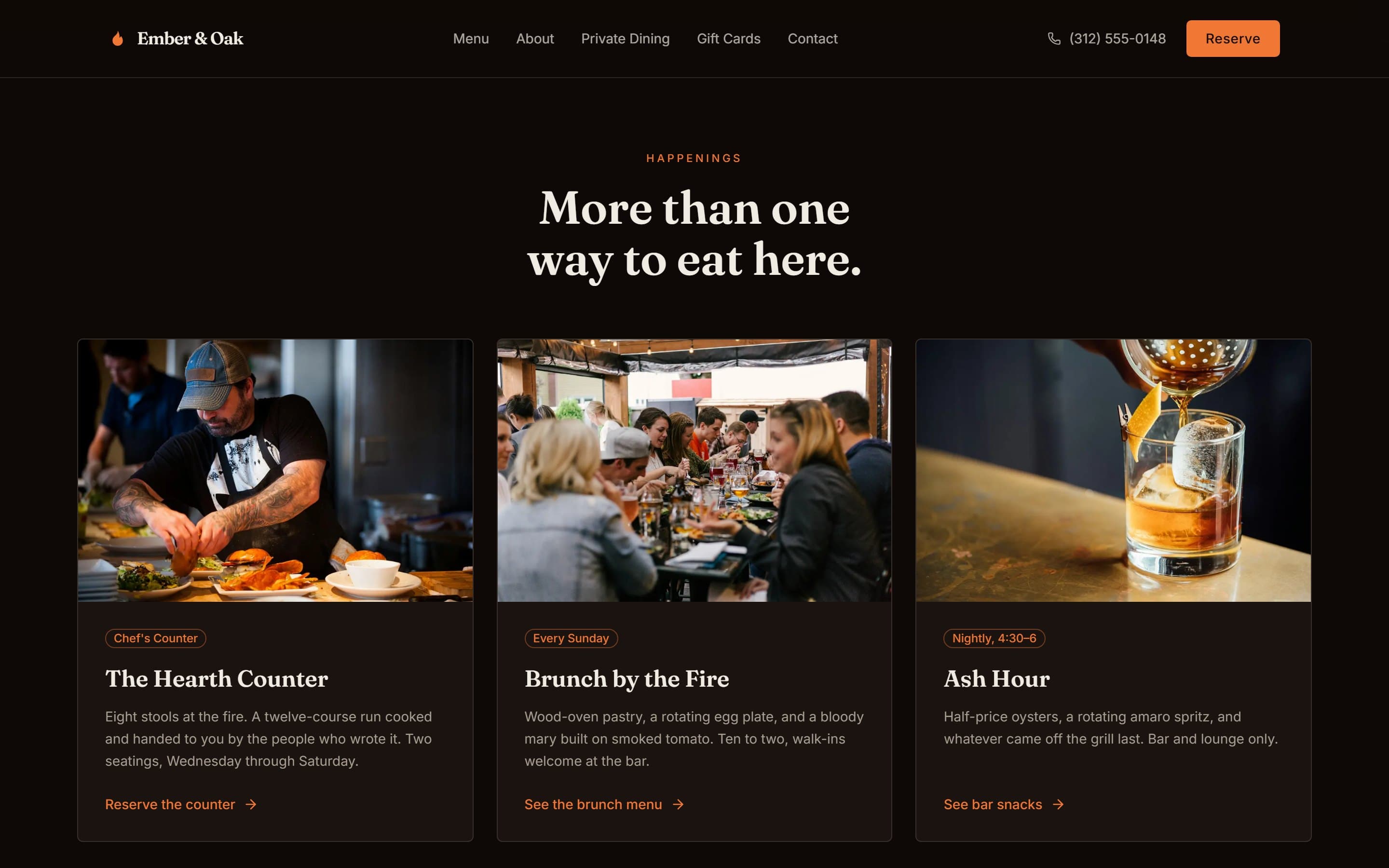
A dark, warm palette and full-bleed food and interior photography, because for a restaurant of this kind the atmosphere is the product as much as the cooking. Three distinct experiences — the hearth counter, brunch, and the late Ash Hour — are given their own cards.
Inside the build
Built for the phone first
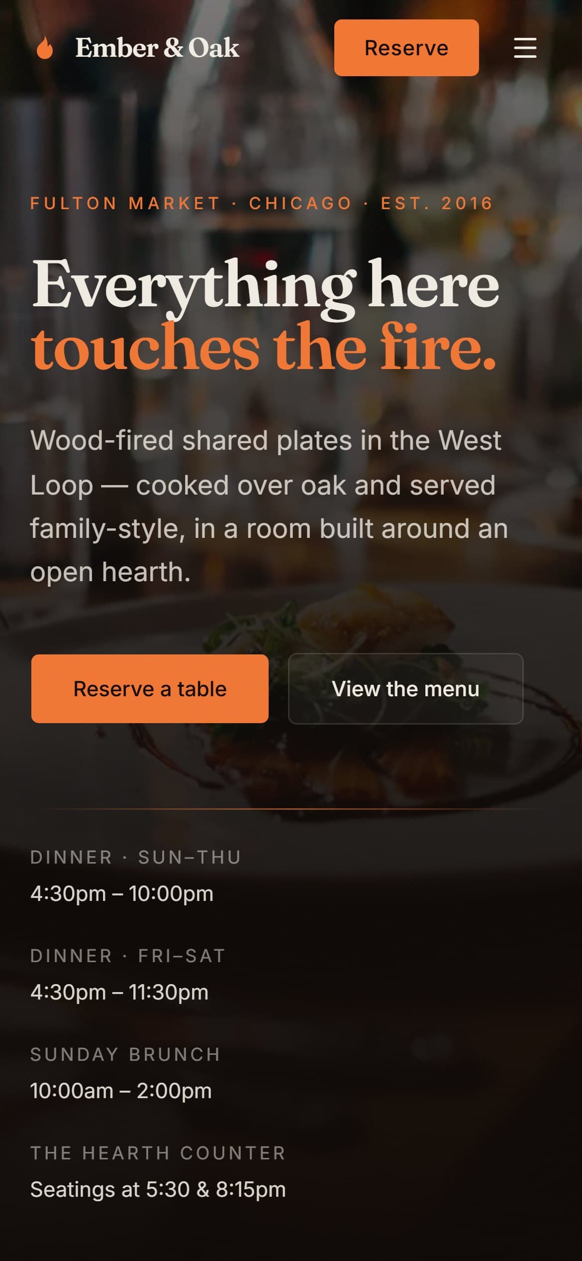
Most visits to a site like this arrive on a phone, and Google indexes the mobile version first. Every layout here is designed at 390px and scaled up, rather than designed on a desktop and squeezed down.
What is in the build
- Full opening hours in the first screen
- Persistent reserve button and click-to-call
- Signature menu as readable text, plus wine list
- Press and award marquee
- Three dining experiences: counter, brunch, late hour
- Private dining and events enquiry
- Gift cards
- Location, map and directions
- Photography-led gallery
- Newsletter signup, one email a month
- Light and dark theme
- Full mobile layout
Built with
- Next.js (App Router)
- React
- Tailwind CSS
- next/image
- Vercel
Mainstream, well-supported technology on purpose. You will never be stuck with software only we can maintain.
Other case studies
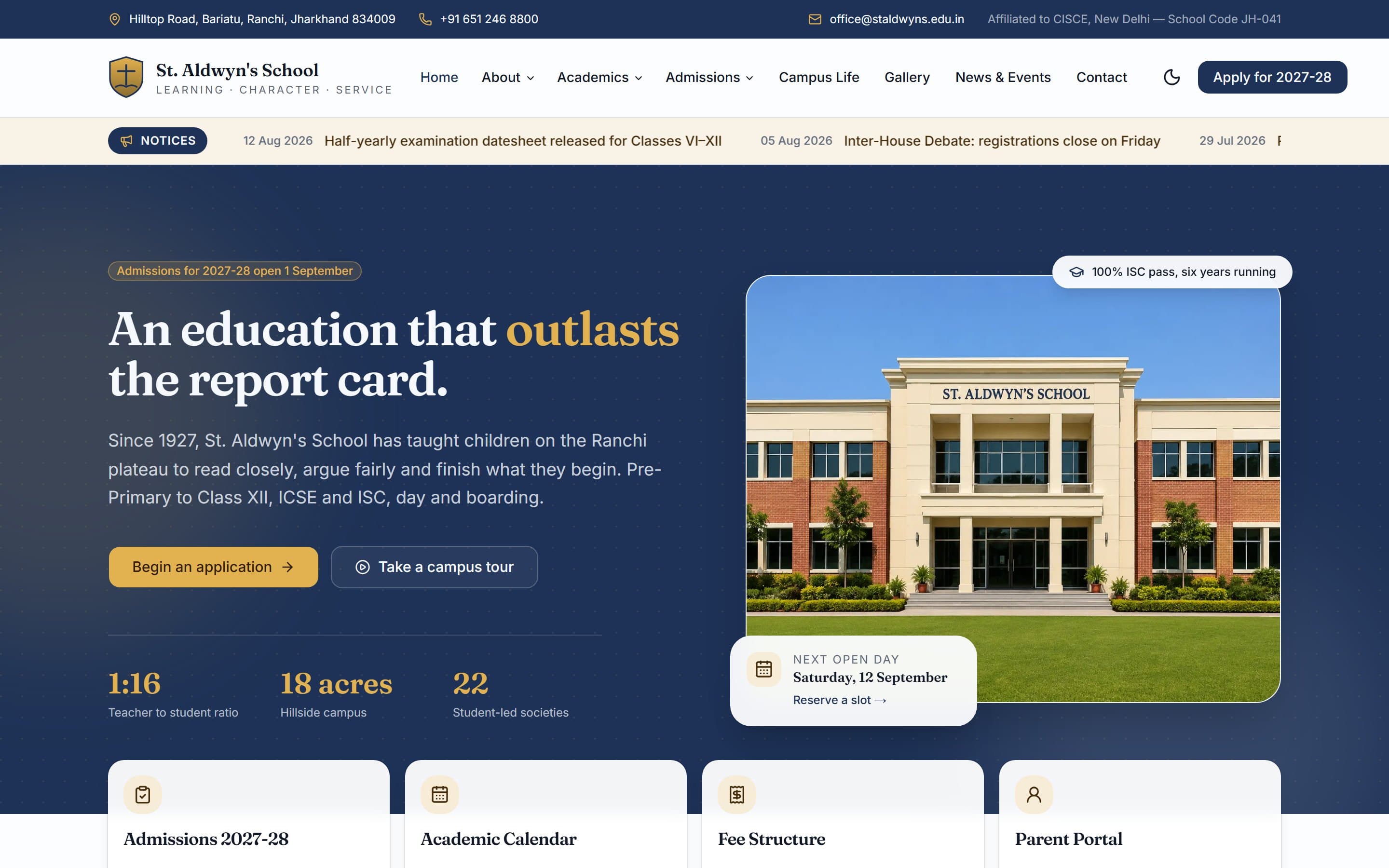
St. Aldwyn's School
A day-and-boarding school site built around one job: turning a parent browsing at 10pm into a booked campus visit.
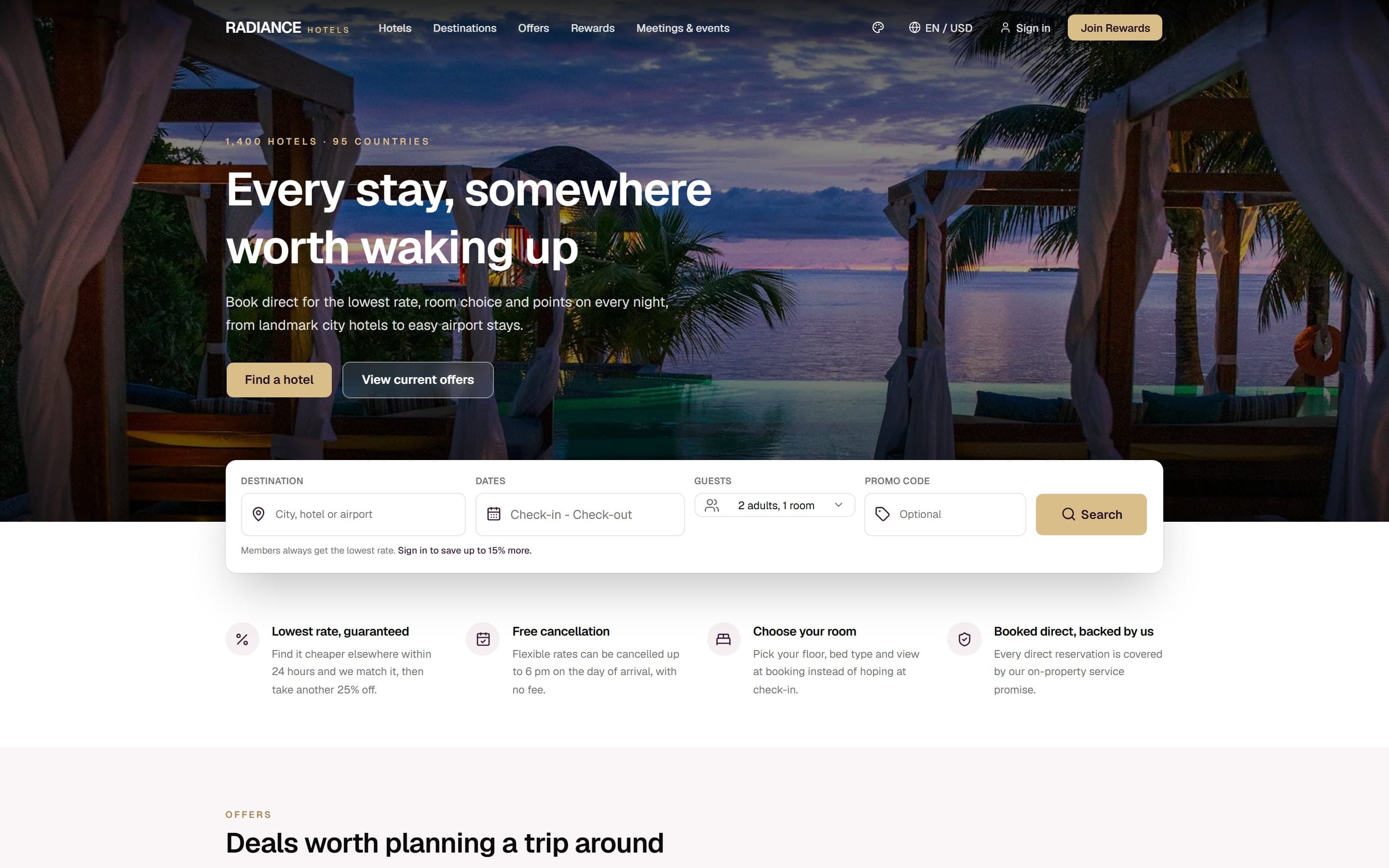
Radiance Hotels
A multi-property hotel group site whose entire structure is an argument for booking direct instead of through Booking.com.
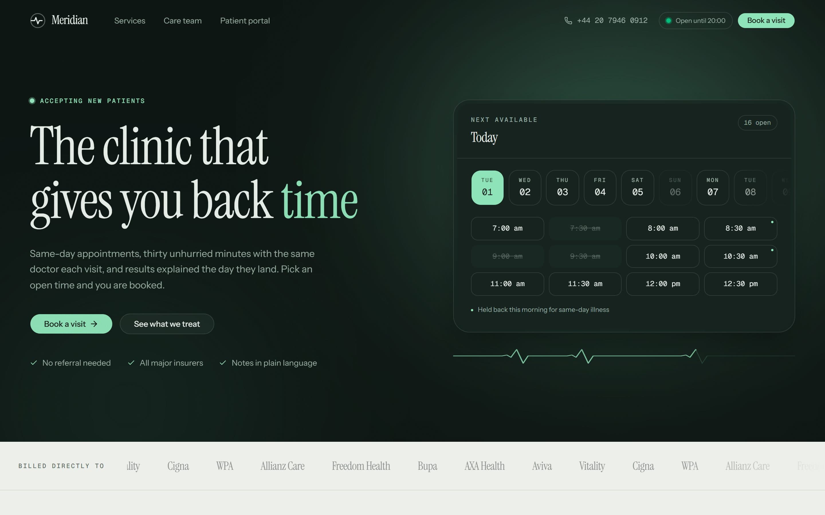
Meridian Clinic
A London private GP practice whose homepage opens on real, bookable time slots instead of a stock photograph of a stethoscope.
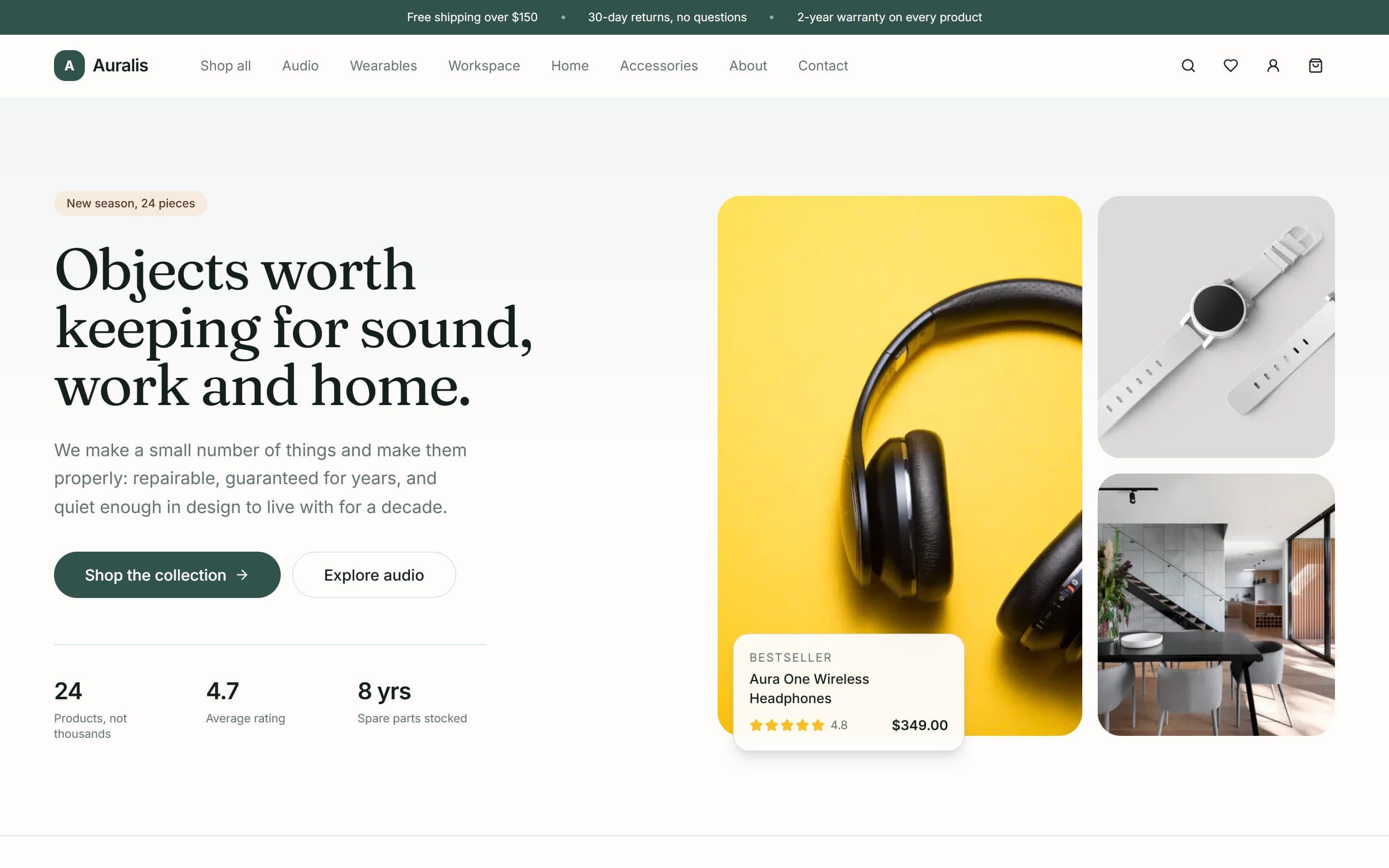
Auralis
A twenty-four product shop for audio, workspace and home goods, built around a deliberately small catalogue and a repair-rather-than-replace promise.
Want something like this?
A free 15-minute call, booked in your timezone, is enough for us to send a fixed written quote.
