
St. Aldwyn's School
An admissions-first website for an independent school
- Typical build
- 2–3 weeks
- Plan
- Business Website
- Sector
- Education
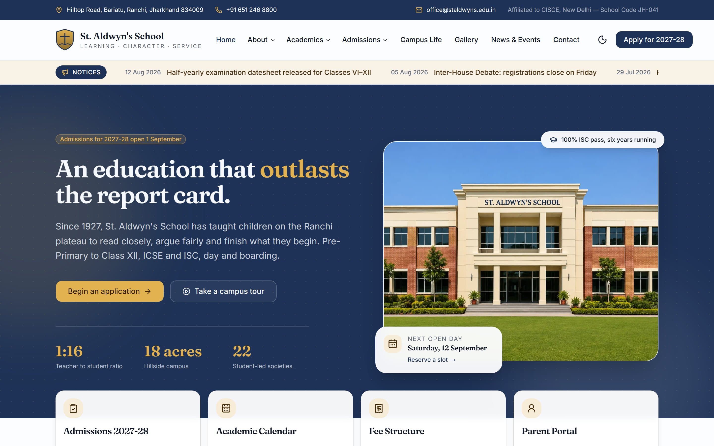
St. Aldwyn's School is a demonstration build. The business is invented, which is exactly why we can show you every page and explain every decision. It is built and deployed to the same standard as client work — open the live demo and click through it.
The brief
St. Aldwyn’s is a demonstration build for an independent ICSE and ISC school — Pre-Primary to Class XII, day and boarding. School websites are unusual because they serve three audiences at once who want completely different things, and most of them fail by treating all three the same.
Three people, three different jobs
Almost every failed site in this sector fails by treating these visitors as one audience.
Prospective parents
Is this school right for my child, and what does it cost? They are comparing three or four schools, usually late at night, usually on a phone.
Current parents
The datesheet, the bus route change, the PTM date. They visit weekly and want the answer in one click, not a tour of your values.
Students and alumni
Results, societies, events, photographs. Low commercial value, high reputational value.
Decisions we made
Every one of these is a choice that could have gone the other way, and a reason it did not.
Admissions is the conversion, so it never leaves the screen
A permanent "Apply for 2027-28" button sits in the header, the hero leads with an application CTA, and the next open day is pinned beside it with a date and a reserve link. A parent should never have to hunt for how to start.
A notices ticker, because that is what current parents come for
Dated notices scroll directly under the header — datesheets, bus route changes, PTM dates. This is the single most-used feature on a real school site and it is usually buried three clicks deep in a PDF.
Four quick actions instead of a mega-menu maze
Admissions, Academic Calendar, Fee Structure and Parent Portal sit as cards immediately below the fold. Between them they cover the large majority of visits.
Proof stated plainly, not as a slogan
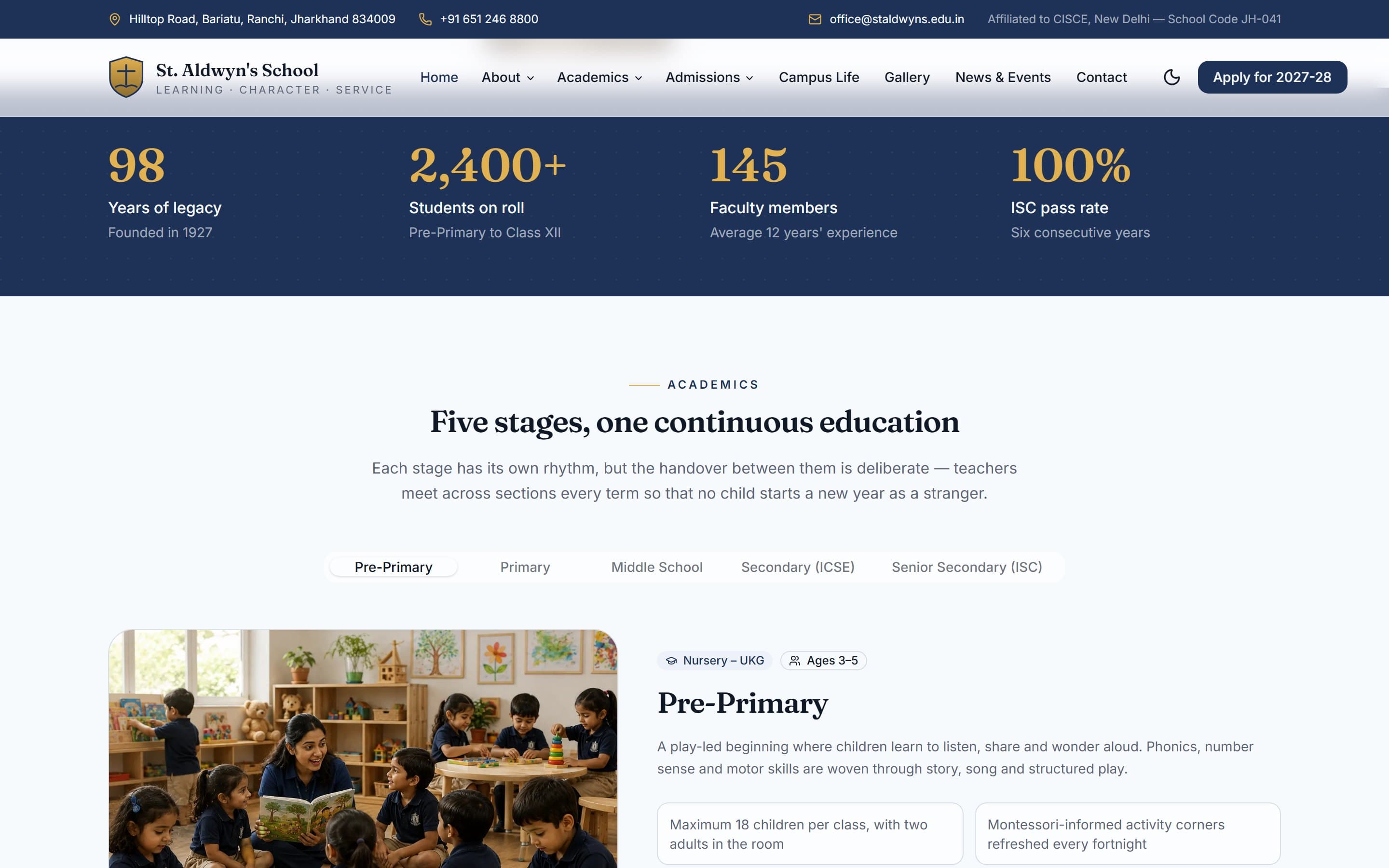
A 1:16 teacher-to-student ratio, an 18-acre campus, 22 student societies, and a six-year ISC pass record. Specific numbers persuade a comparing parent; "excellence in education" does not.
The campus does the selling
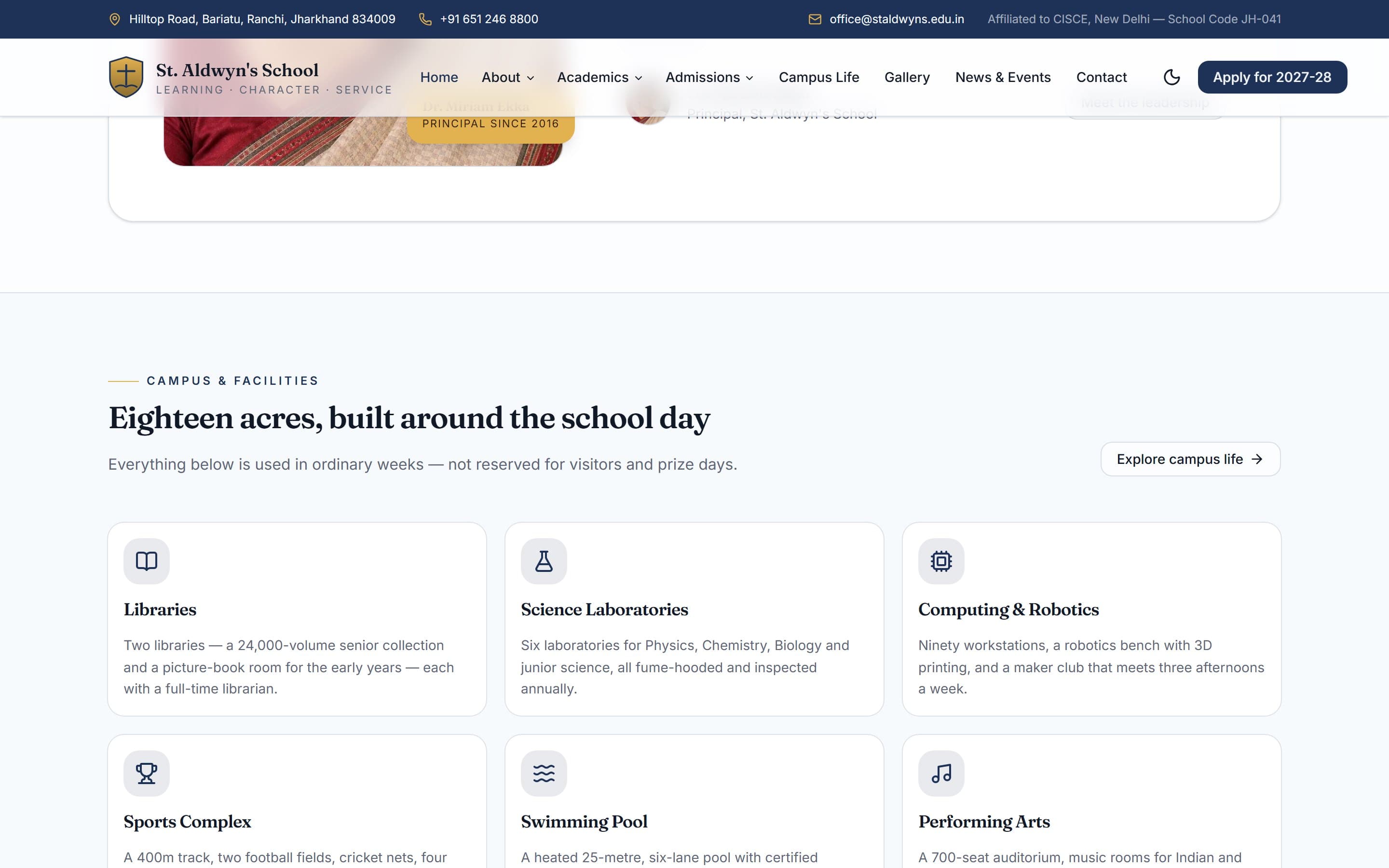
Facilities are shown as a real grid — libraries, science laboratories, computing and robotics, sports complex, swimming pool, performing arts — with a photo gallery and a virtual tour CTA, because for boarding especially, parents buy the place.
Inside the build
Built for the phone first
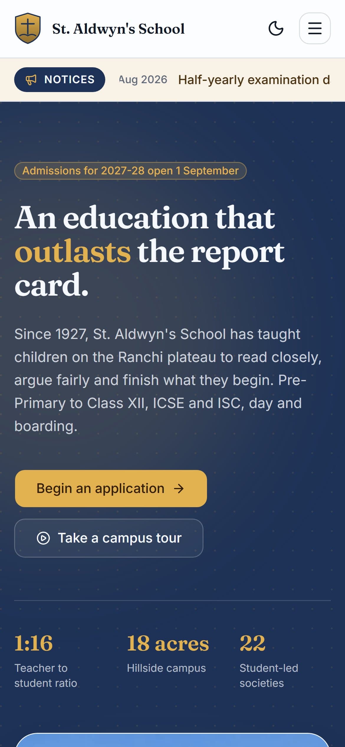
Most visits to a site like this arrive on a phone, and Google indexes the mobile version first. Every layout here is designed at 390px and scaled up, rather than designed on a desktop and squeezed down.
What is in the build
- Dated notices ticker for current parents
- Multi-level navigation across About, Academics and Admissions
- Admissions CTA persistent in the header
- Open-day booking prompt with live date
- Five academic stages, Pre-Primary to Class XII
- Campus facilities grid with photography
- News, events and academic calendar
- Photo gallery
- Parent, alumni and teacher testimonials
- Fee structure and parent portal entry points
- Light and dark theme
- Full mobile layout
Built with
- Next.js (App Router)
- React
- Tailwind CSS
- next/image
- Vercel
Mainstream, well-supported technology on purpose. You will never be stuck with software only we can maintain.
Other case studies
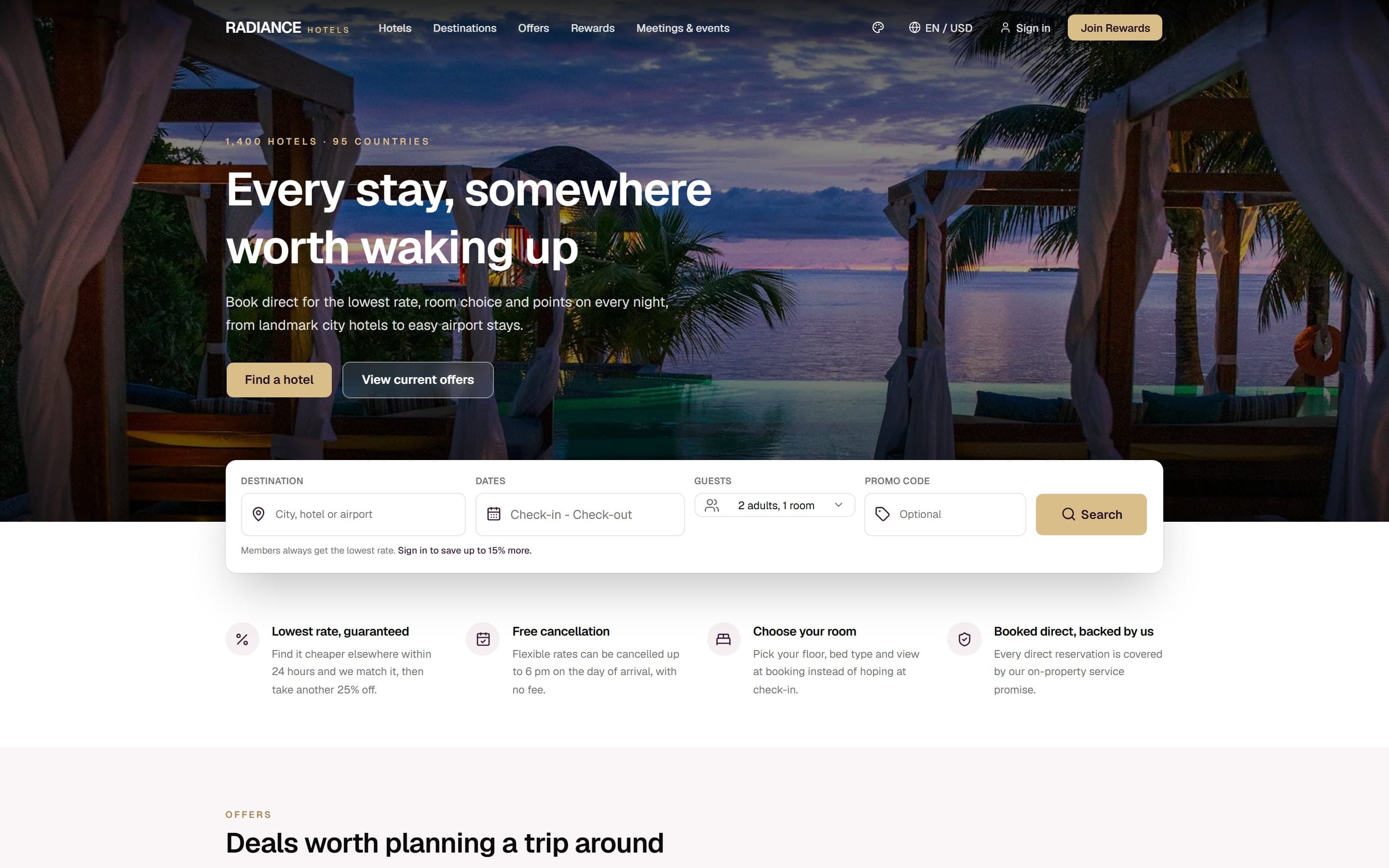
Radiance Hotels
A multi-property hotel group site whose entire structure is an argument for booking direct instead of through Booking.com.
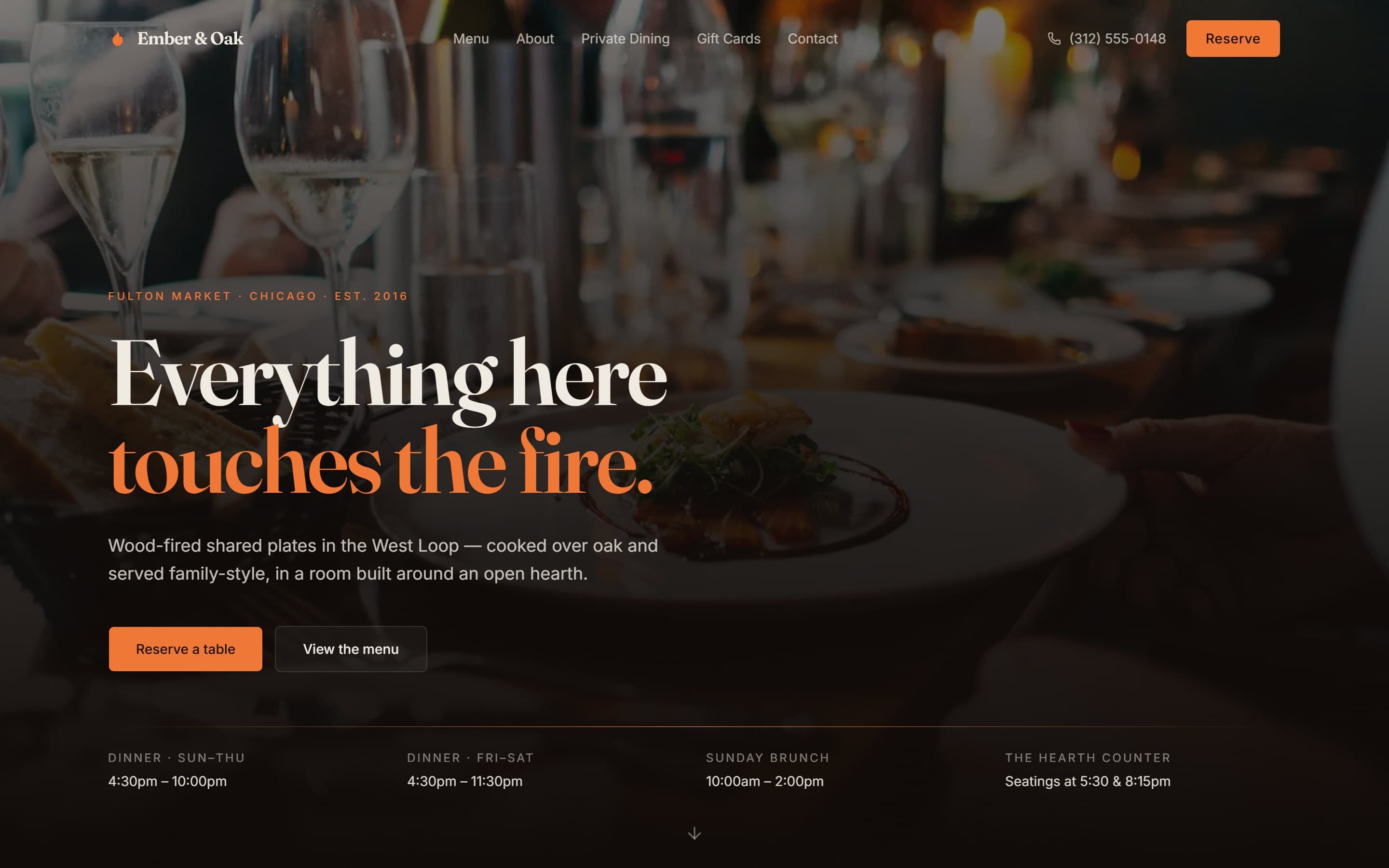
Ember & Oak
A wood-fired Chicago restaurant site designed around the three things a hungry person actually needs in under ten seconds.
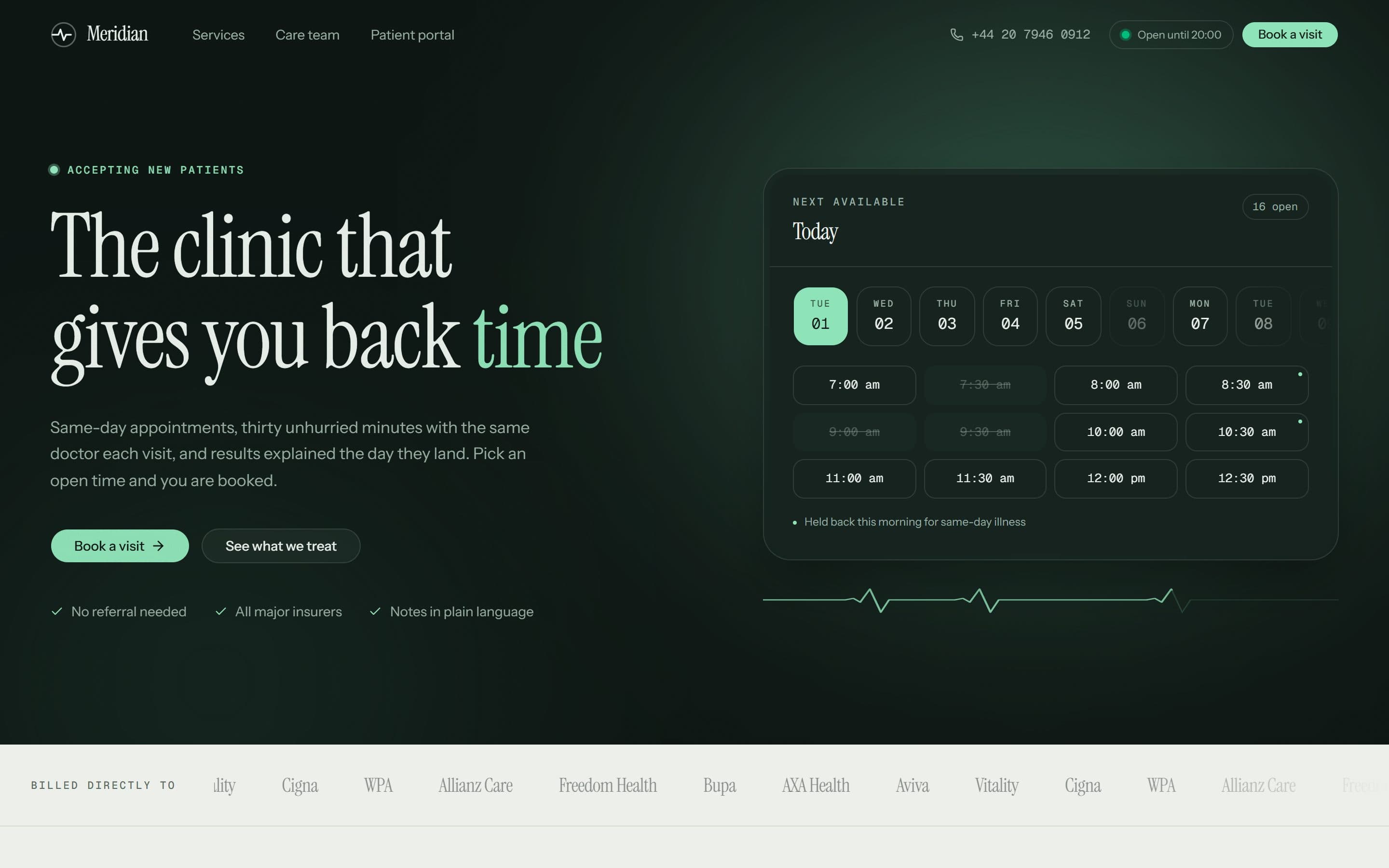
Meridian Clinic
A London private GP practice whose homepage opens on real, bookable time slots instead of a stock photograph of a stethoscope.
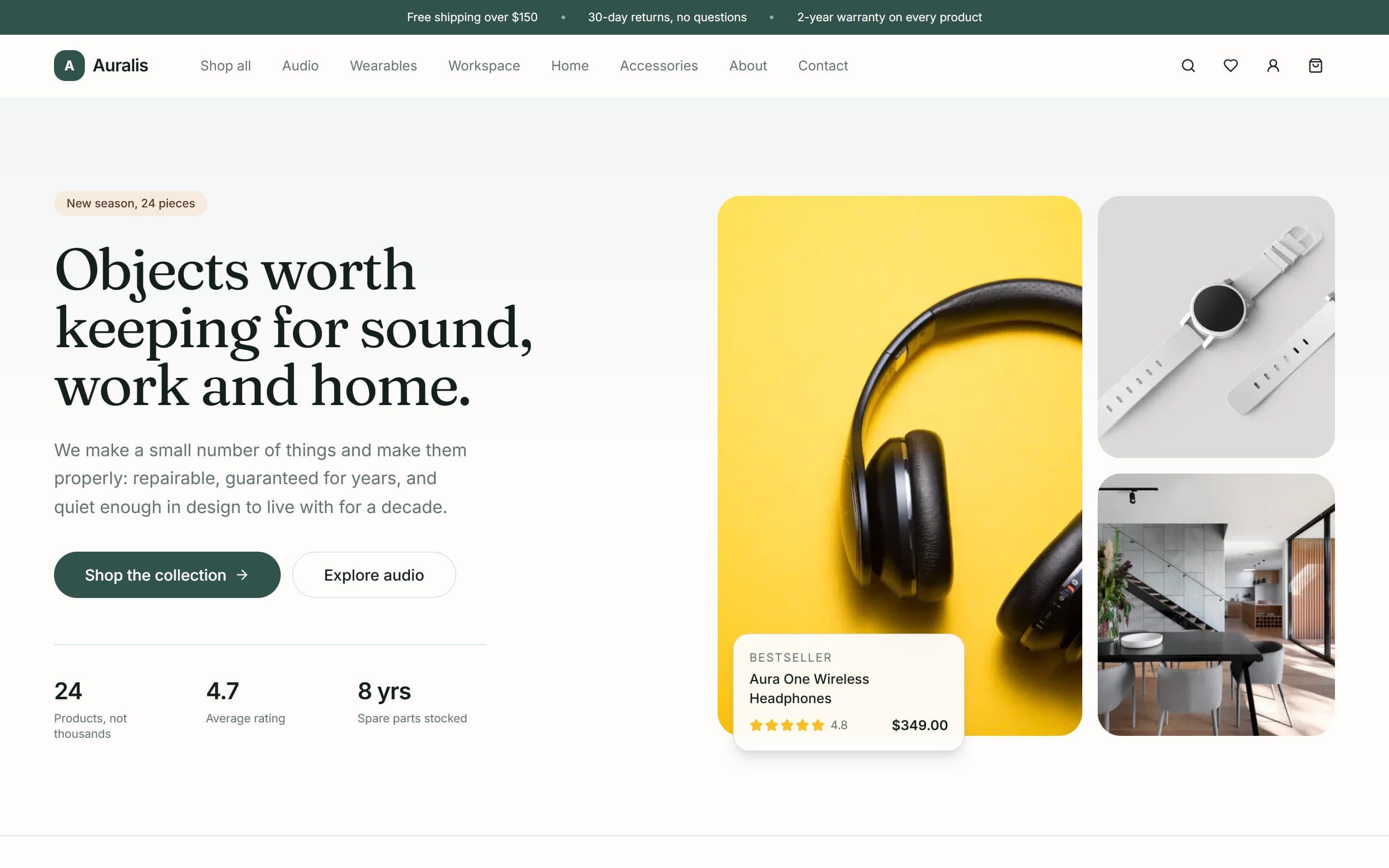
Auralis
A twenty-four product shop for audio, workspace and home goods, built around a deliberately small catalogue and a repair-rather-than-replace promise.
Want something like this?
A free 15-minute call, booked in your timezone, is enough for us to send a fixed written quote.
