
Auralis
A storefront that argues for keeping the thing you bought
- Typical build
- 4–6 weeks
- Plan
- E-commerce & Web Apps
- Sector
- Retail & e-commerce
Auralis is a demonstration build. The business is invented, which is exactly why we can show you every page and explain every decision. It is built and deployed to the same standard as client work — open the live demo and click through it.
The brief
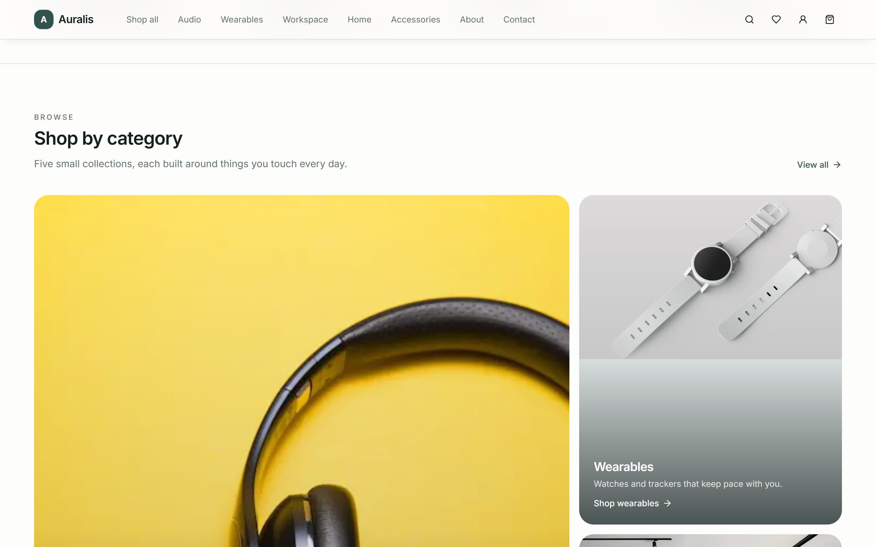
Auralis is a demonstration storefront for a small design-led retailer — twenty-four products across audio, wearables, workspace, home and accessories, shipped from Rotterdam. It is built to show the shape of a catalogue shop, and to make an argument most small retailers get wrong: a shop with two dozen products should not be built like a shop with two thousand.
Three people, three different jobs
Almost every failed site in this sector fails by treating these visitors as one audience.
The browser with no particular intent
To be shown something. They arrived from social or a newsletter and will leave in seconds unless the first screen gives them a reason not to.
The shopper who knows the category
Headphones, a desk lamp, a backpack. They want to reach a filtered grid in one click and compare four things without opening four tabs.
The shopper deciding whether to trust you with a card
Shipping cost, returns window, warranty, and whether anyone else has bought this. For an unfamiliar brand, this is the whole purchase decision.
Decisions we made
Every one of these is a choice that could have gone the other way, and a reason it did not.
The small catalogue is the pitch, not an apology for it
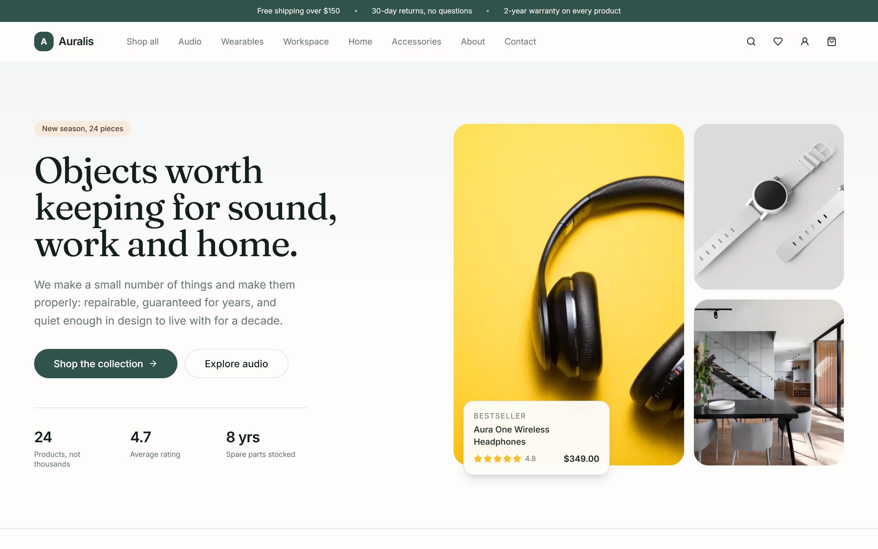
The hero says “new season, 24 pieces” and the counters beside it read 24 products, not thousands. Under them: a 4.7 average rating, and spare parts stocked for eight years. A small retailer competing with a marketplace cannot win on breadth, so the site makes the narrowness the reason to buy.
Shipping, returns and warranty sit directly beneath the fold
Free shipping over $150 with carbon-neutral delivery in two to four days, thirty-day returns, a two-year warranty extending to lifetime on carry goods, and spare parts held for eight years. Those are the four questions that decide a first purchase from an unfamiliar shop, and answering them on the checkout page is answering them several minutes too late.
Add to bag from every grid, never only from the product page
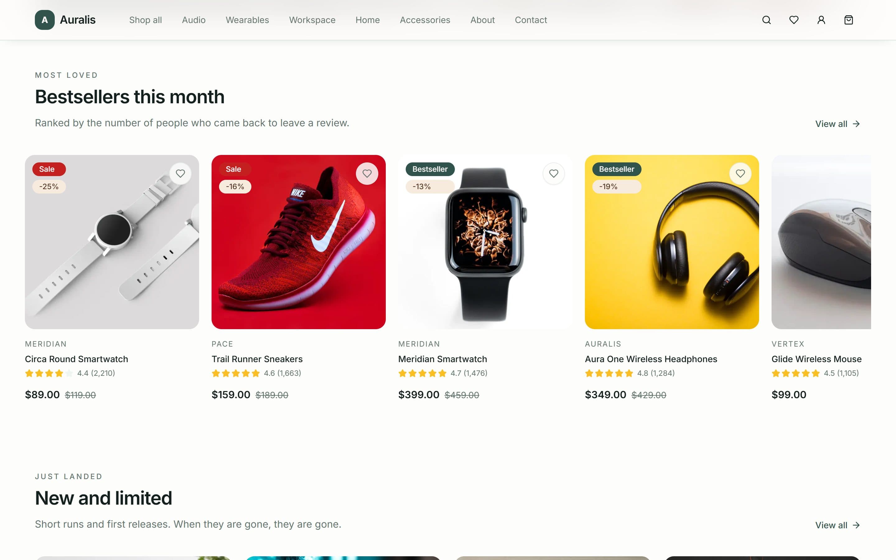
Each card carries the price, the sale price where there is one with its discount as a percentage, the star rating with its review count, and an add-to-bag control. A shopper who has already decided should not have to load a product page in order to act.
Three ranked grids, each with a stated reason for its order
Editors’ picks are what the team actually uses; best sellers this month are ranked by how many buyers came back to leave a review; just landed is short runs and first releases. “Featured products” tells a shopper nothing — a stated ordering rule is a reason to trust the shelf.
The newsletter promises restraint in the sign-up itself
“Two emails a month. No countdown timers.”, with one-click unsubscribe stated up front. Reviews are attributed to a person, a job and a city rather than to initials. Both are the same decision: on a storefront nobody has heard of, credibility comes from handing over the things that would let a shopper catch you exaggerating.
Inside the build
Built for the phone first
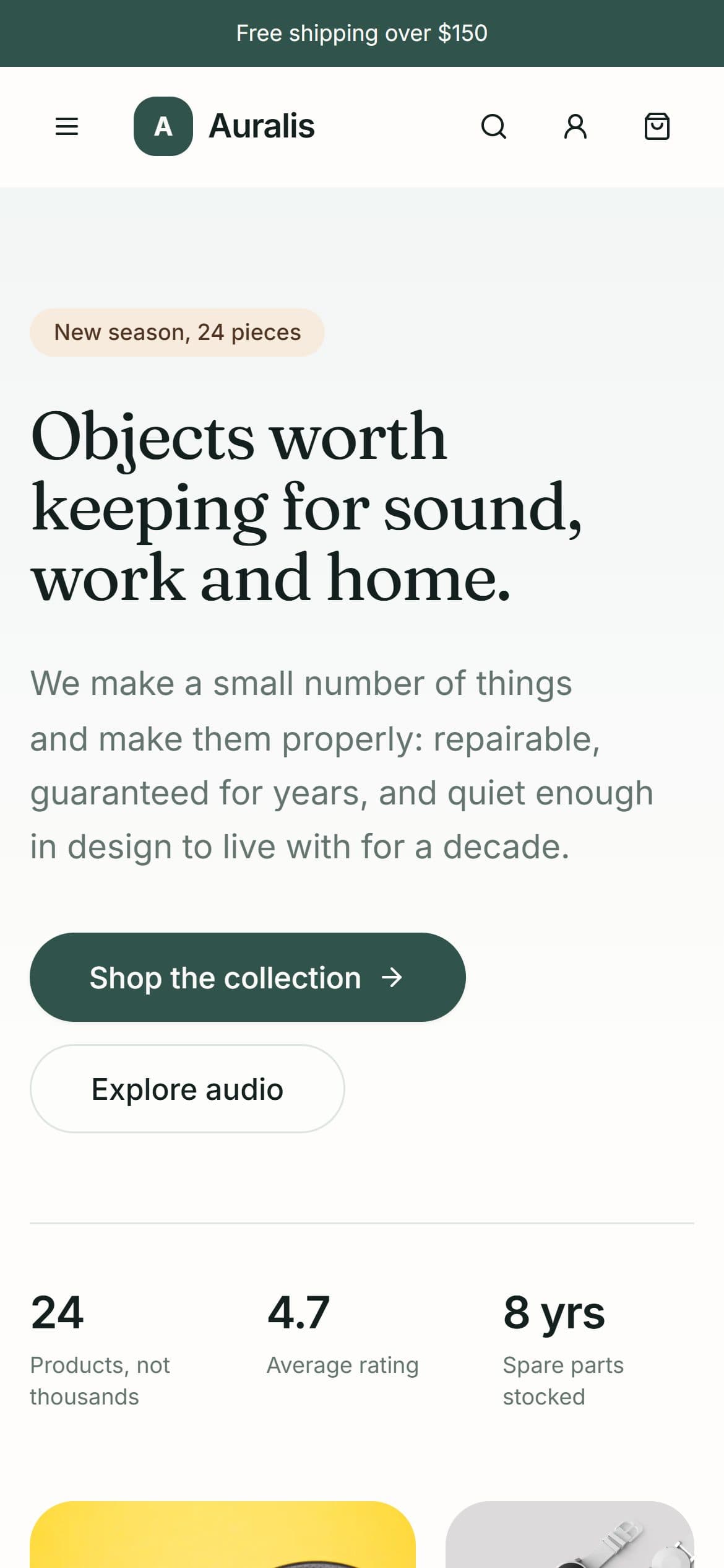
Most visits to a site like this arrive on a phone, and Google indexes the mobile version first. Every layout here is designed at 390px and scaled up, rather than designed on a desktop and squeezed down.
What is in the build
- Five categories: audio, wearables, workspace, home, accessories
- Add to bag directly from every product grid
- Sale pricing with the discount shown as a percentage
- Star ratings with review counts on every card
- Shipping, returns, warranty and repair terms above the fold
- Editors’ picks, monthly best sellers and new arrivals
- Limited and new-release badging
- Multi-brand catalogue across seven house brands
- Customer reviews attributed to a person and a place
- Newsletter signup, account, wishlist and order tracking
- Light and dark theme
- Full mobile layout
Built with
- Next.js (App Router)
- React
- Tailwind CSS
- next/image
- Vercel
Mainstream, well-supported technology on purpose. You will never be stuck with software only we can maintain.
Other case studies
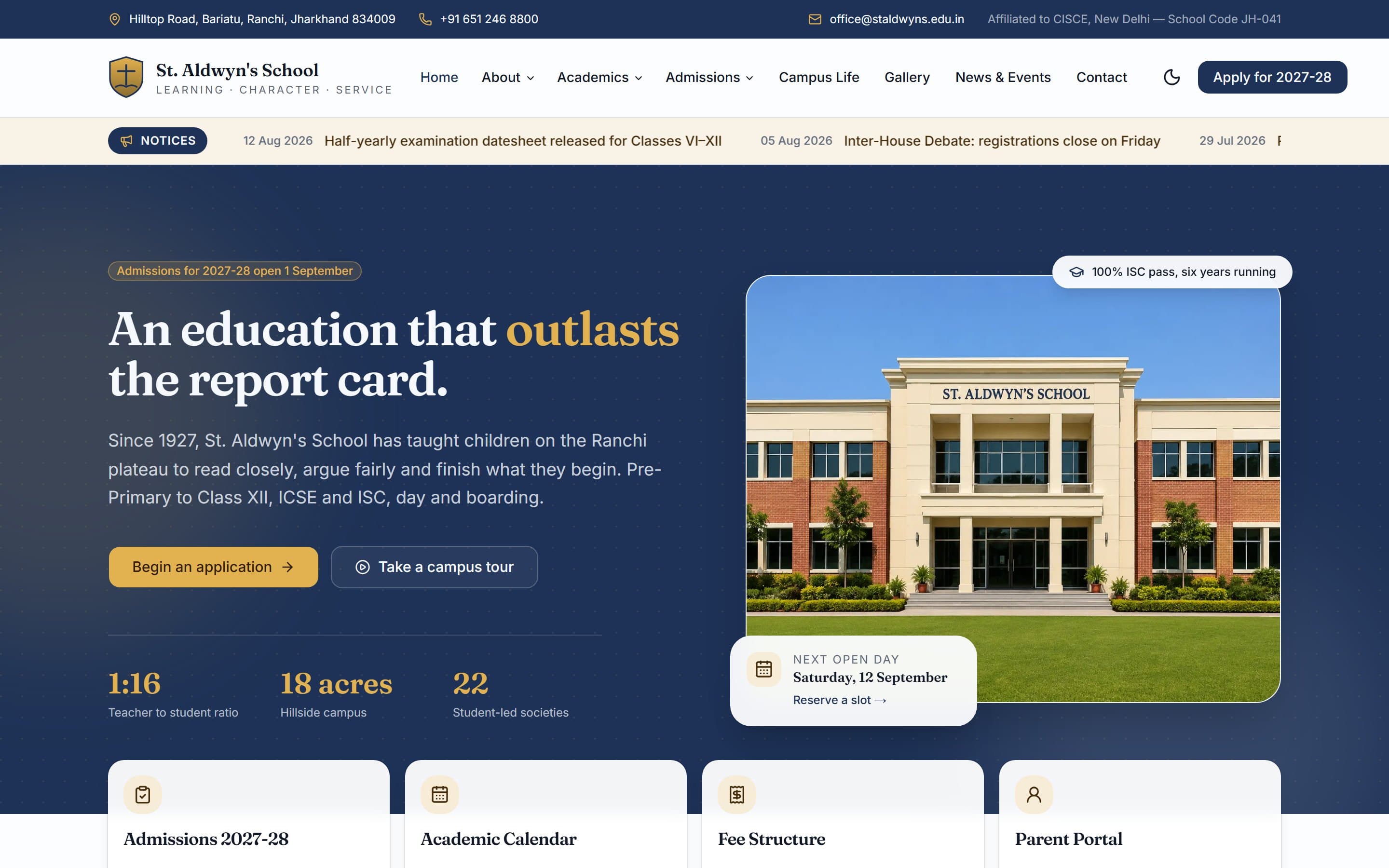
St. Aldwyn's School
A day-and-boarding school site built around one job: turning a parent browsing at 10pm into a booked campus visit.
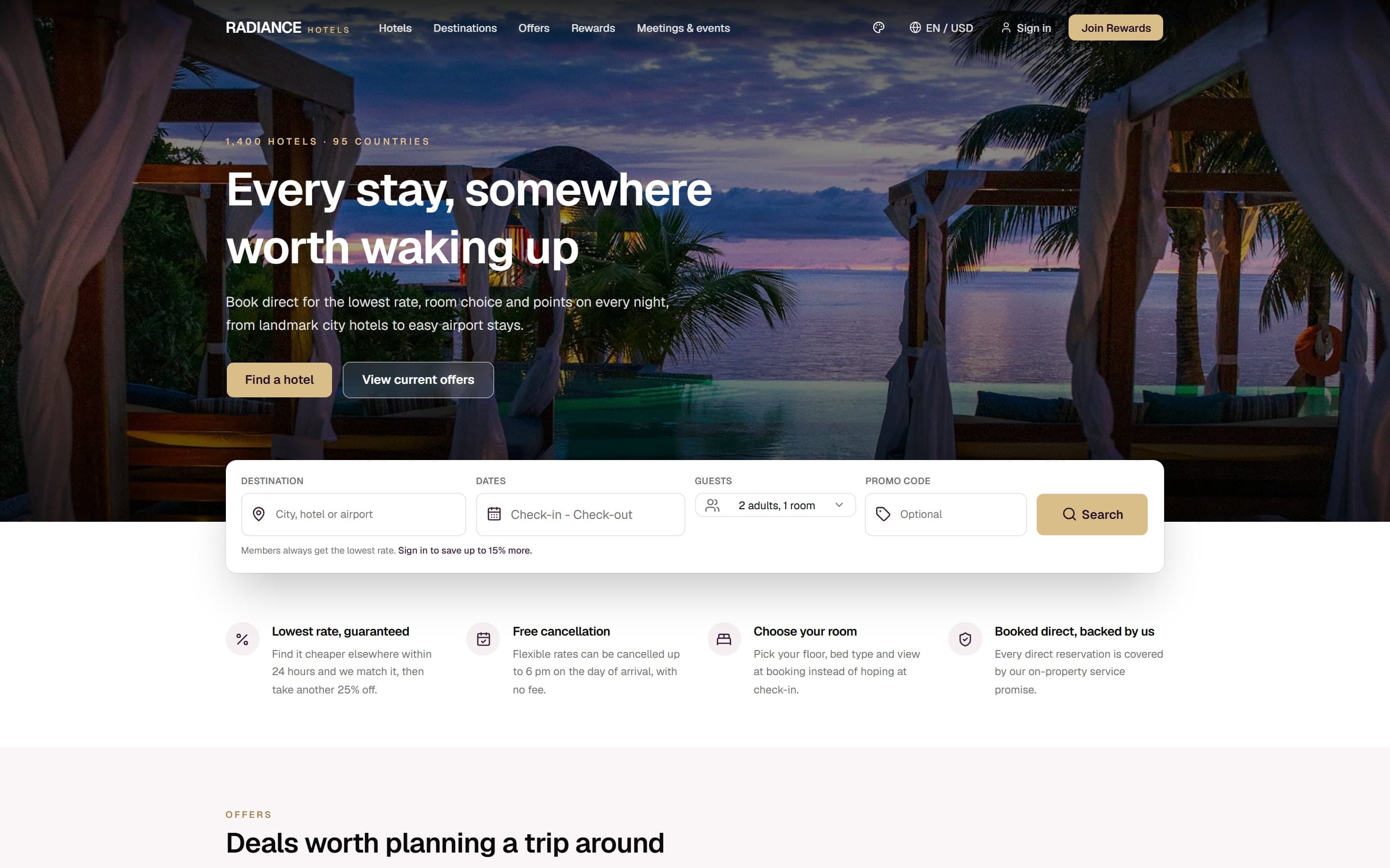
Radiance Hotels
A multi-property hotel group site whose entire structure is an argument for booking direct instead of through Booking.com.
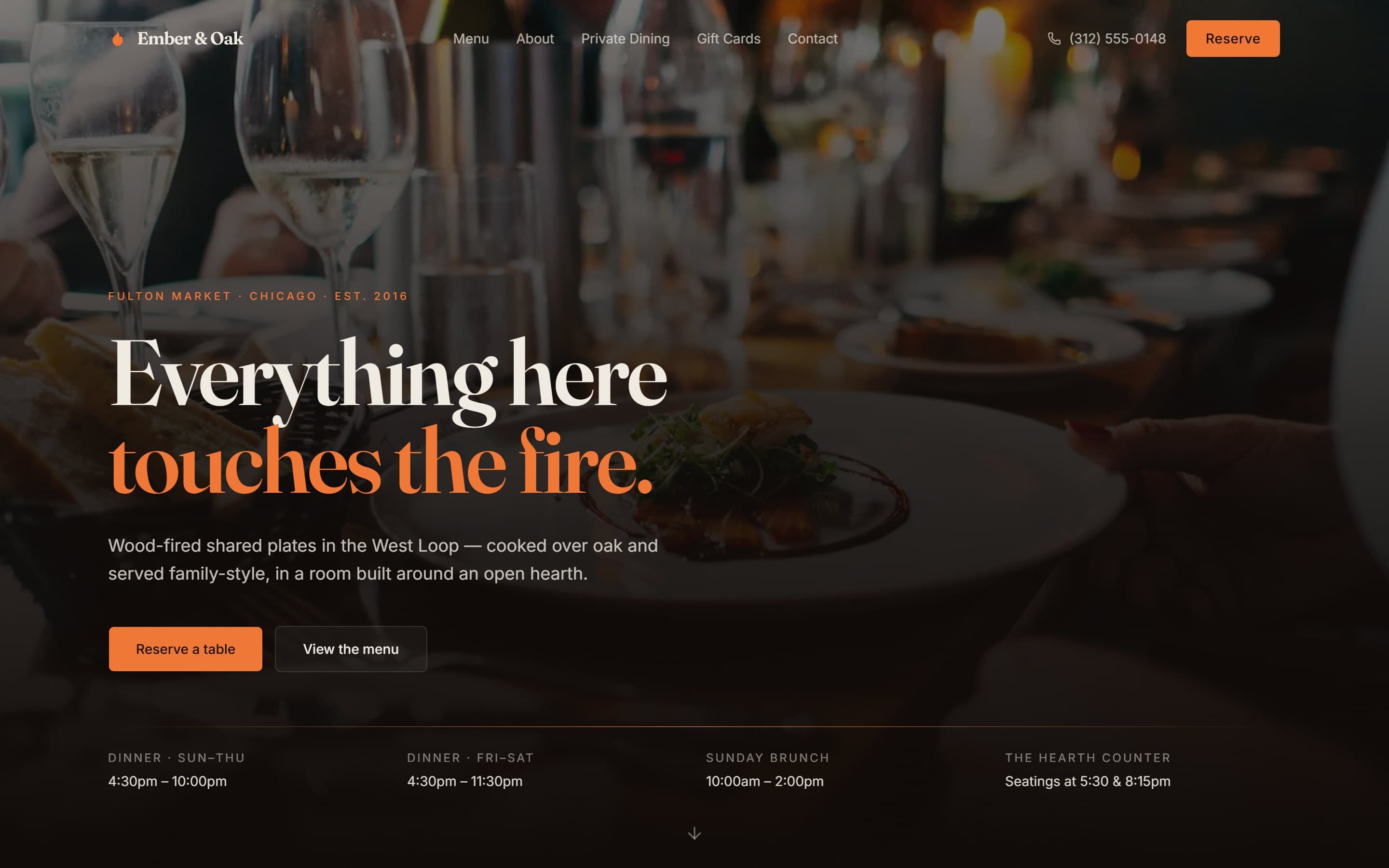
Ember & Oak
A wood-fired Chicago restaurant site designed around the three things a hungry person actually needs in under ten seconds.
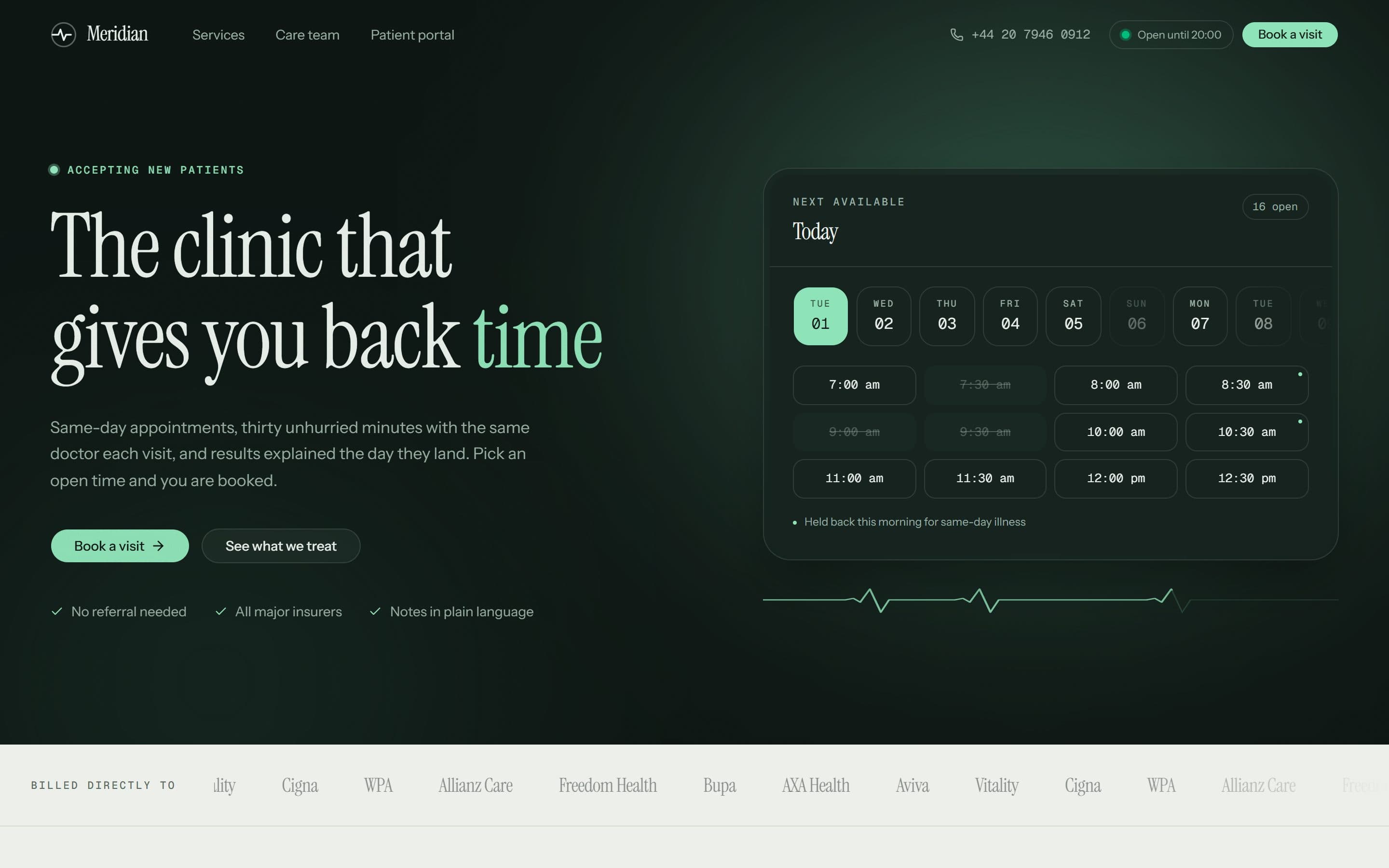
Meridian Clinic
A London private GP practice whose homepage opens on real, bookable time slots instead of a stock photograph of a stethoscope.
Want something like this?
A free 15-minute call, booked in your timezone, is enough for us to send a fixed written quote.
