
Meridian Clinic
A clinic site where the appointment calendar is the first thing you see
- Typical build
- 3–4 weeks
- Plan
- Business Website
- Sector
- Healthcare
Meridian Clinic is a demonstration build. The business is invented, which is exactly why we can show you every page and explain every decision. It is built and deployed to the same standard as client work — open the live demo and click through it.
The brief
Meridian is a demonstration build for a private general practice in London — twelve clinicians, same-day appointments, and thirty-minute visits. Healthcare sites are unusual in that the visitor is often unwell, often anxious, and almost always trying to answer one narrow question before they will read anything else: can I be seen, and when.
Three people, three different jobs
Almost every failed site in this sector fails by treating these visitors as one audience.
The patient who needs to be seen today
A time, this week, ideally this morning. They are unwell and impatient with anything that is not a calendar. If the site cannot show them one, they phone somewhere that will.
The patient choosing a practice to register with
Who the doctors are, what a visit costs, whether their insurer is accepted, and whether they will see the same person twice. This is a considered decision made over several visits to the site.
The existing patient
Results, the portal, and the phone number. Frequent, brief visits that must not be made to wade through the marketing written for the other two.
Decisions we made
Every one of these is a choice that could have gone the other way, and a reason it did not.
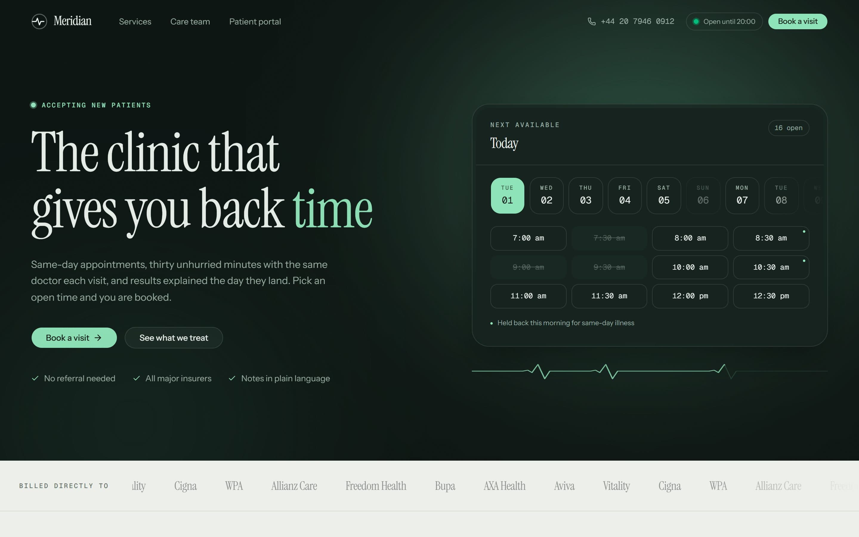
The booking calendar is in the hero, with real times on it
Ten days run across the top and actual half-hour slots sit underneath, with a count of how many are open today and a note that the morning slots are held back for same-day illness. Nearly every clinic site puts a “Book an appointment” button here instead, which is one more click and, worse, an unanswered question: a button does not tell you whether anything is free.
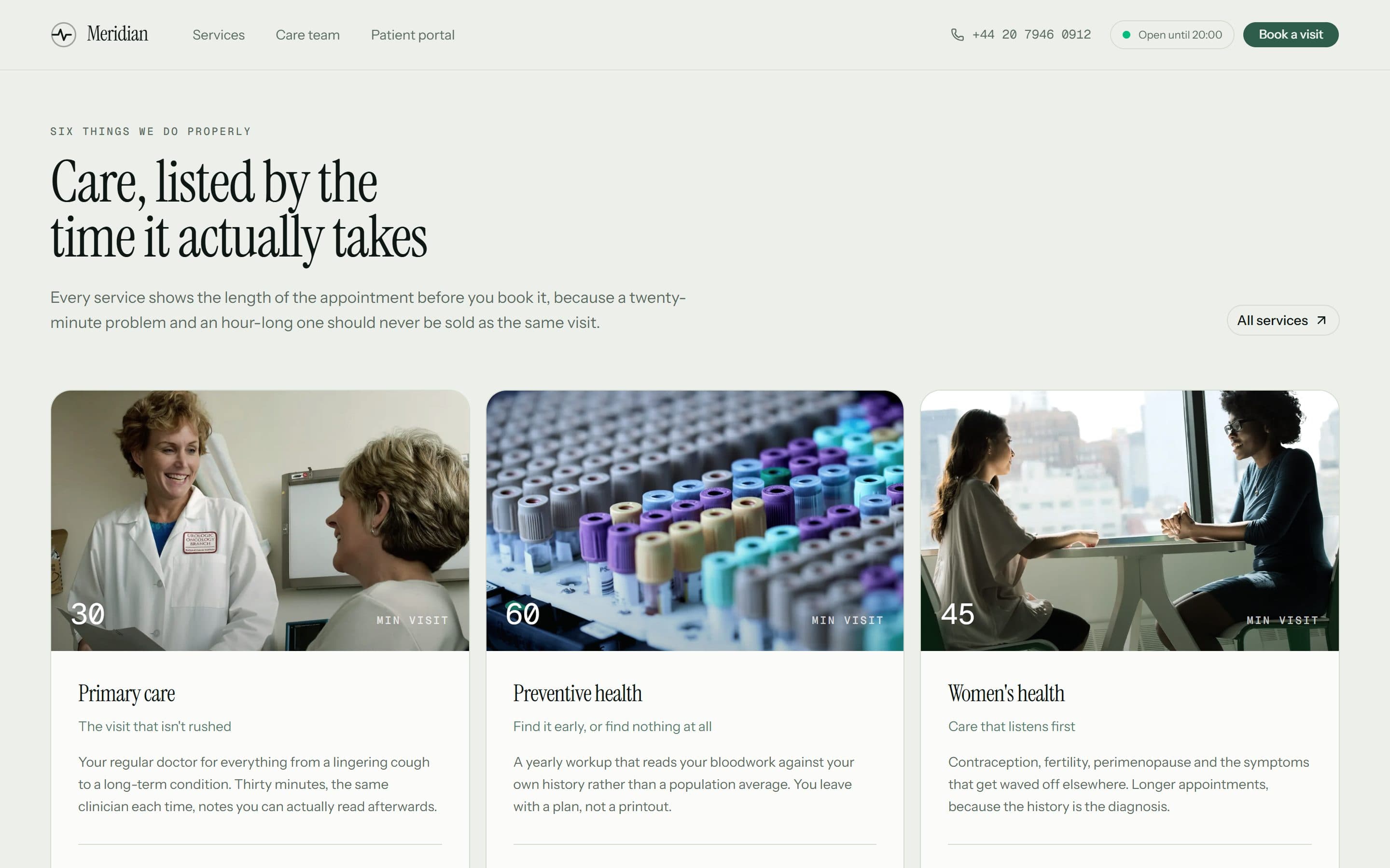
Every service states its appointment length and its price
Six services, each showing the visit length before the description and a from-price after it — primary care at thirty minutes from £90, a preventive health workup at sixty. A twenty-minute problem and an hour-long one should never be sold as the same visit, and a private patient who cannot find a price assumes the worst one.
The insurers are named, as logos, immediately below the fold
Bupa, AXA Health, Aviva, Vitality, Cigna, WPA, Allianz Care and Freedom Health, under the heading “billed directly to”. For a private practice this is a qualifying question the visitor would otherwise have to phone to ask, and the answer decides whether they carry on reading.
Continuity of care is built into the booking flow, not claimed in a paragraph
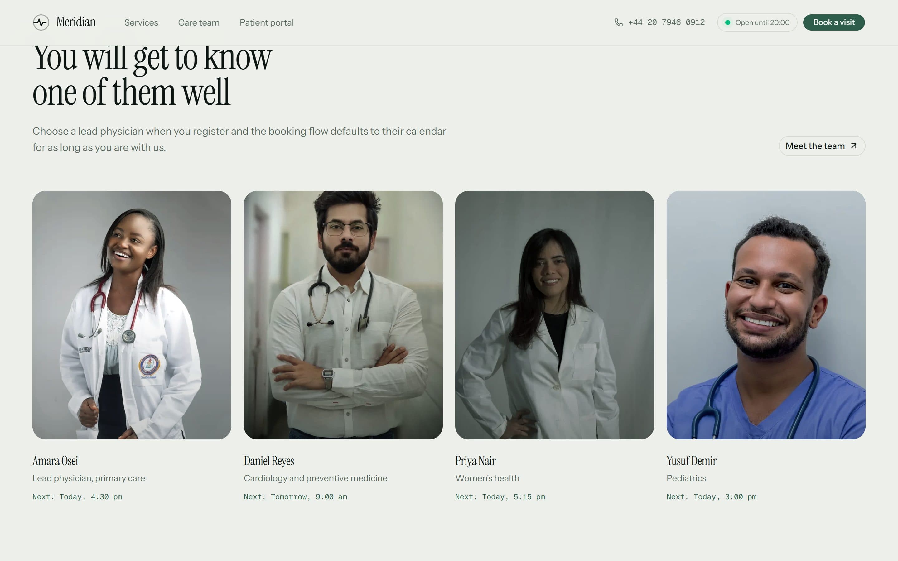
Each of the twelve clinicians has a card carrying their next available time, and choosing a lead physician at registration makes the booking flow default to their calendar. Seeing the same doctor each visit is the practice’s central promise, so the site demonstrates it rather than asserting it.
The claims are the ones a patient can check within a week
Median wait for a same-day slot, standard appointment length, share of results returned inside twenty-four hours. A four-step path from open tab to answer sets the same expectations — two minutes to describe the problem, a real slot, thirty minutes with the doctor, notes in the portal by six. Every one of those is falsifiable by the next patient through the door, which is what makes it worth stating.
Inside the build
Built for the phone first
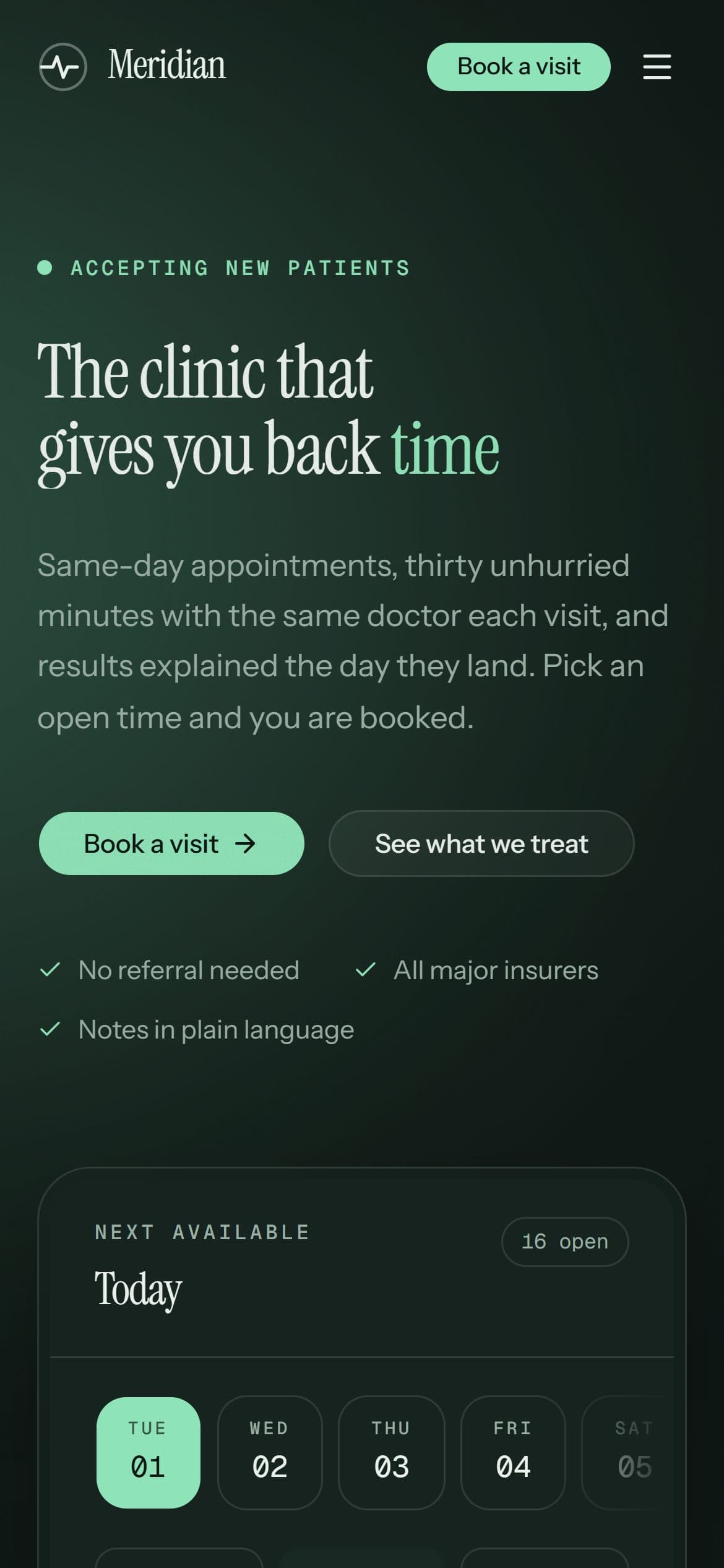
Most visits to a site like this arrive on a phone, and Google indexes the mobile version first. Every layout here is designed at 390px and scaled up, rather than designed on a desktop and squeezed down.
What is in the build
- Live appointment picker in the hero: ten days, half-hour slots
- Same-day slots held back and labelled as such
- Six services, each with visit length and from-price
- Direct-billing insurers shown as a logo band
- Twelve-clinician team with next-available times
- Lead-physician selection at registration
- Four-step explanation of what happens after booking
- Opening-hours status in the header
- Patient portal and click-to-call entry points
- Patient testimonials and a pre-booking FAQ
- Emergency-services notice in the footer
- Light and dark theme
- Full mobile layout
Built with
- Next.js (App Router)
- React
- Tailwind CSS
- next/image
- Vercel
Mainstream, well-supported technology on purpose. You will never be stuck with software only we can maintain.
Other case studies
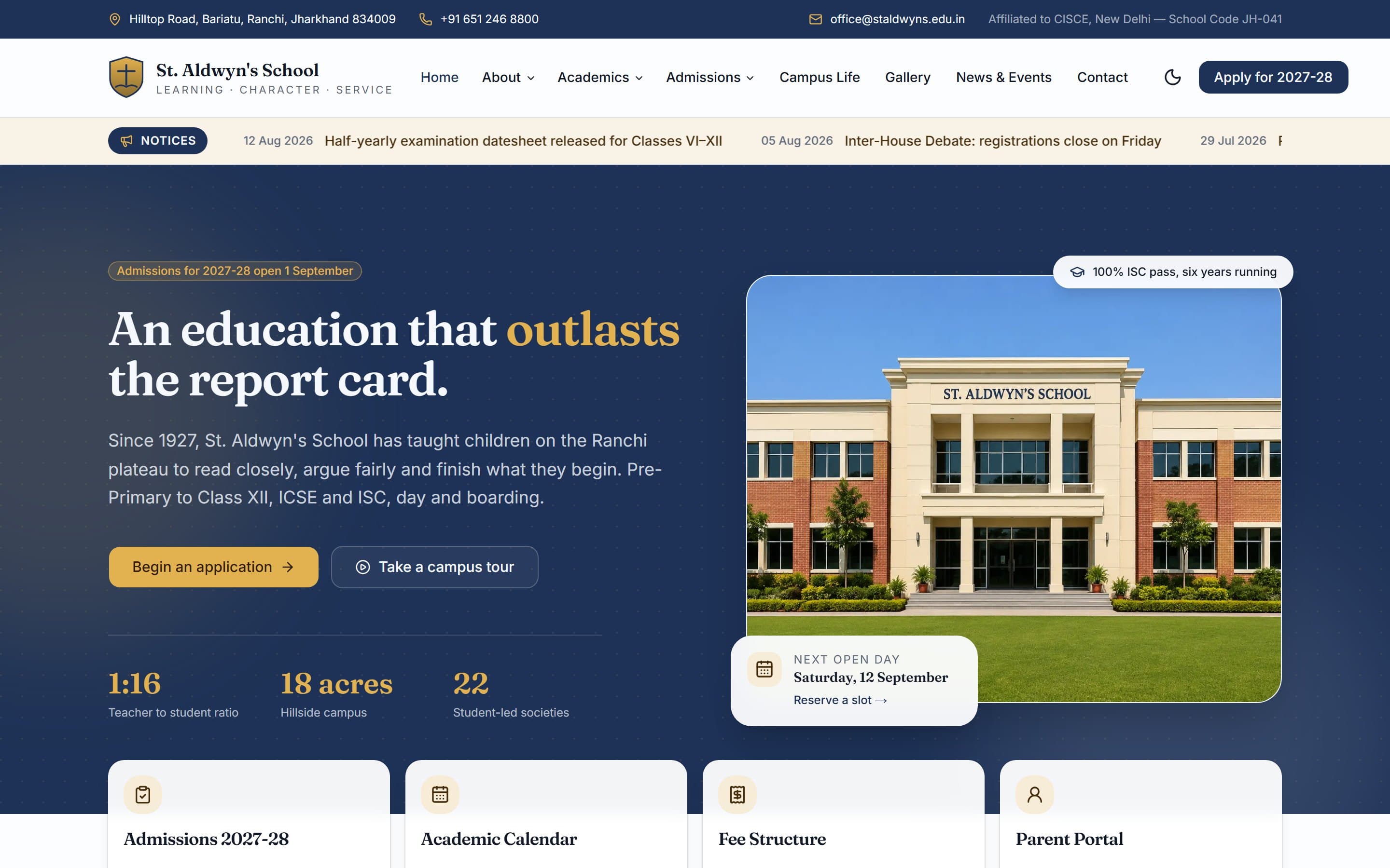
St. Aldwyn's School
A day-and-boarding school site built around one job: turning a parent browsing at 10pm into a booked campus visit.
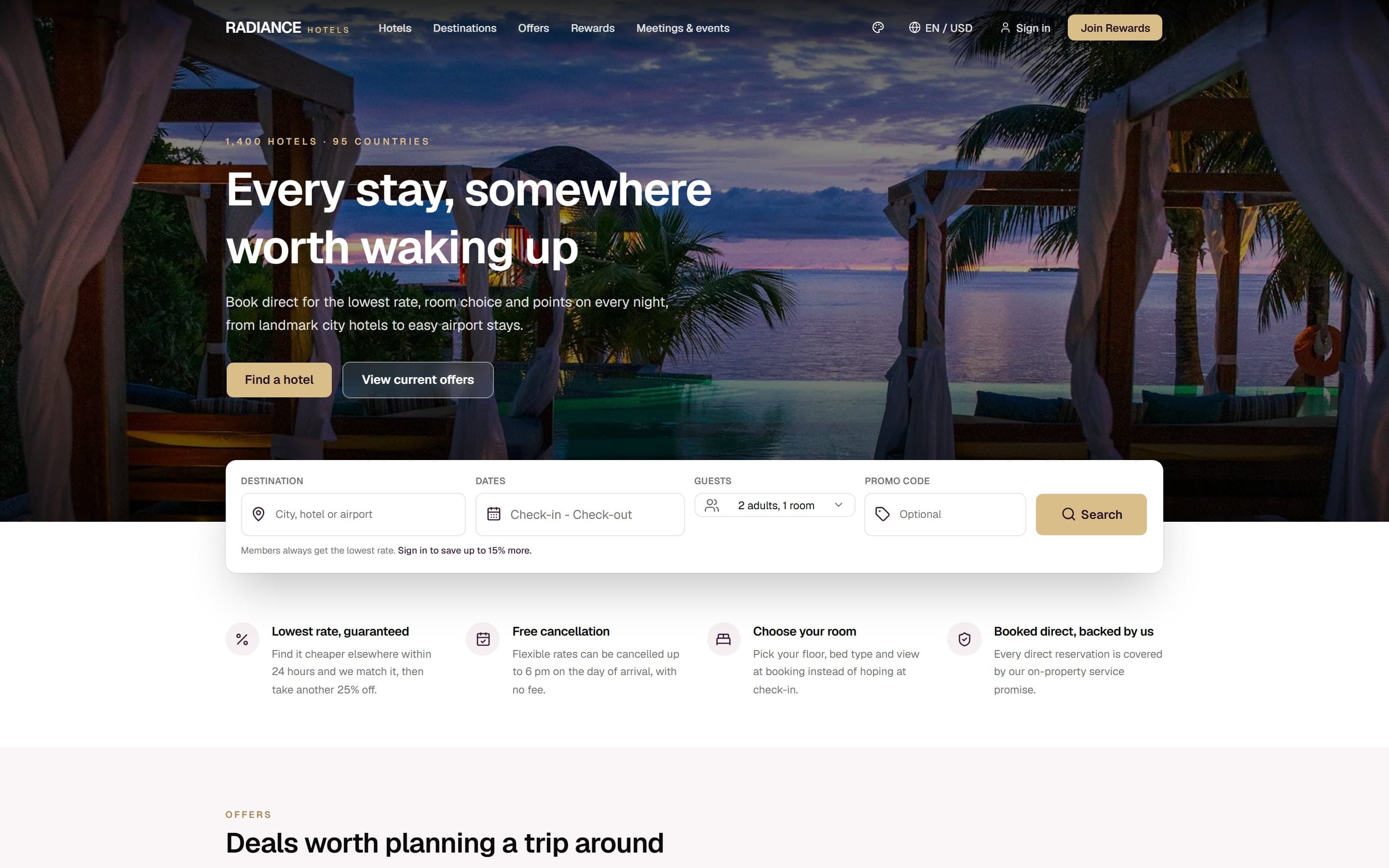
Radiance Hotels
A multi-property hotel group site whose entire structure is an argument for booking direct instead of through Booking.com.
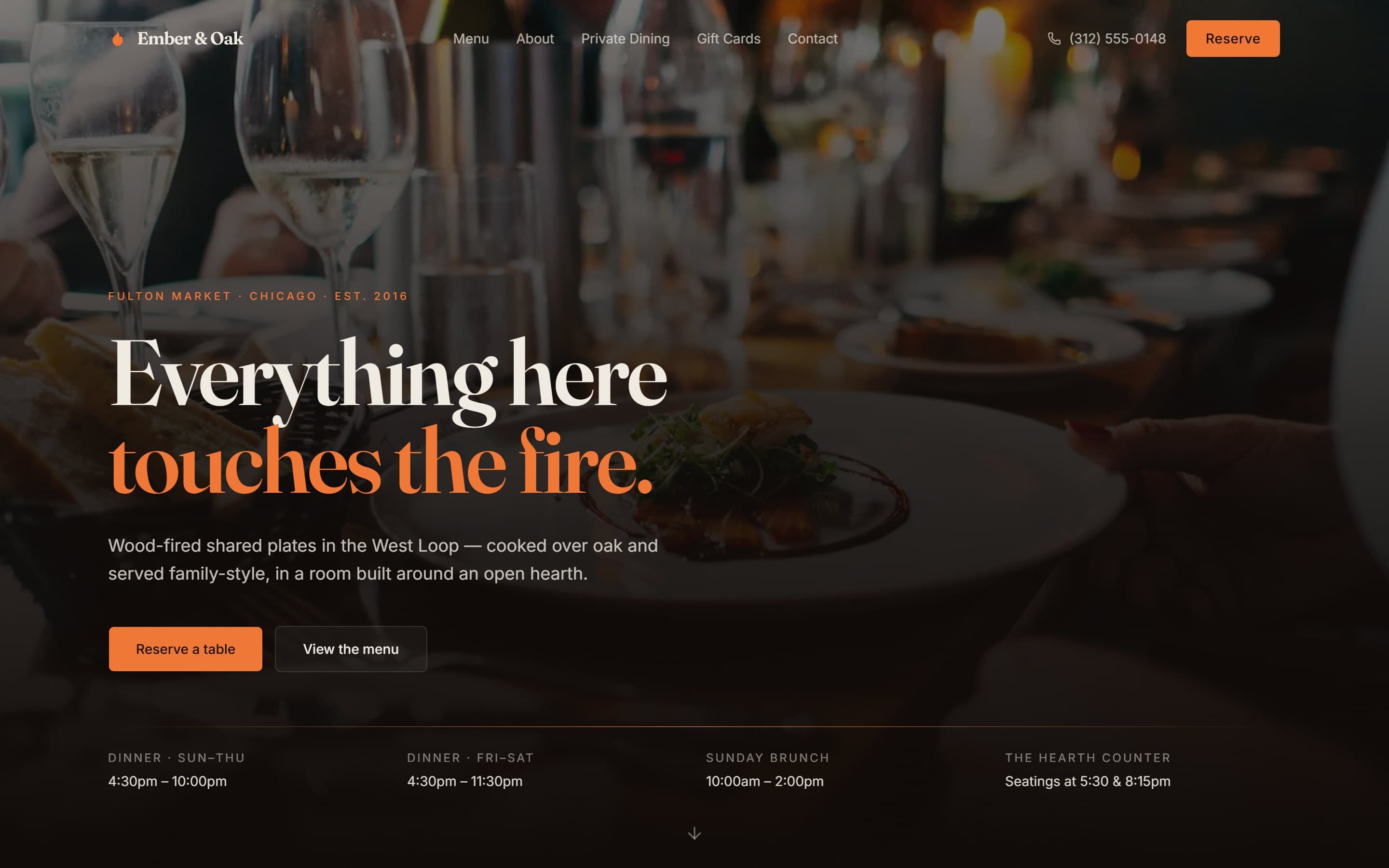
Ember & Oak
A wood-fired Chicago restaurant site designed around the three things a hungry person actually needs in under ten seconds.
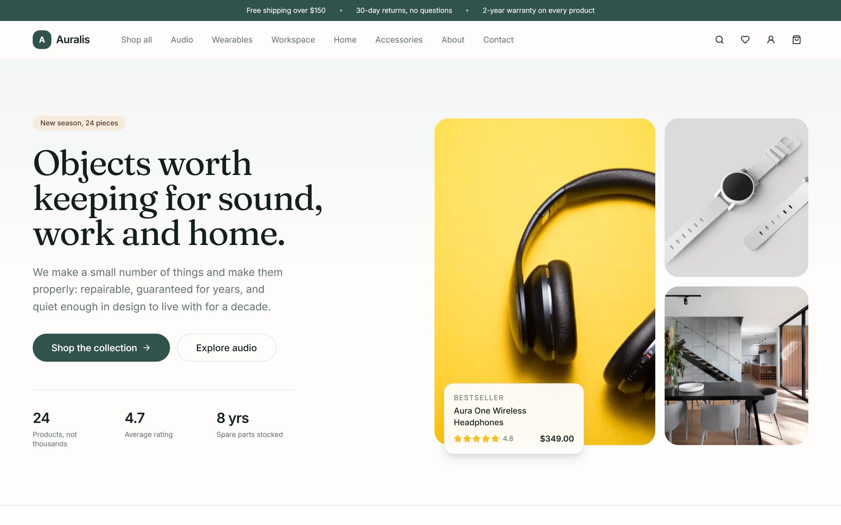
Auralis
A twenty-four product shop for audio, workspace and home goods, built around a deliberately small catalogue and a repair-rather-than-replace promise.
Want something like this?
A free 15-minute call, booked in your timezone, is enough for us to send a fixed written quote.
