
Radiance Hotels
A direct-booking site built to win the guest back from the OTAs
- Typical build
- 4–6 weeks
- Plan
- E-commerce & Web Apps
- Sector
- Hospitality
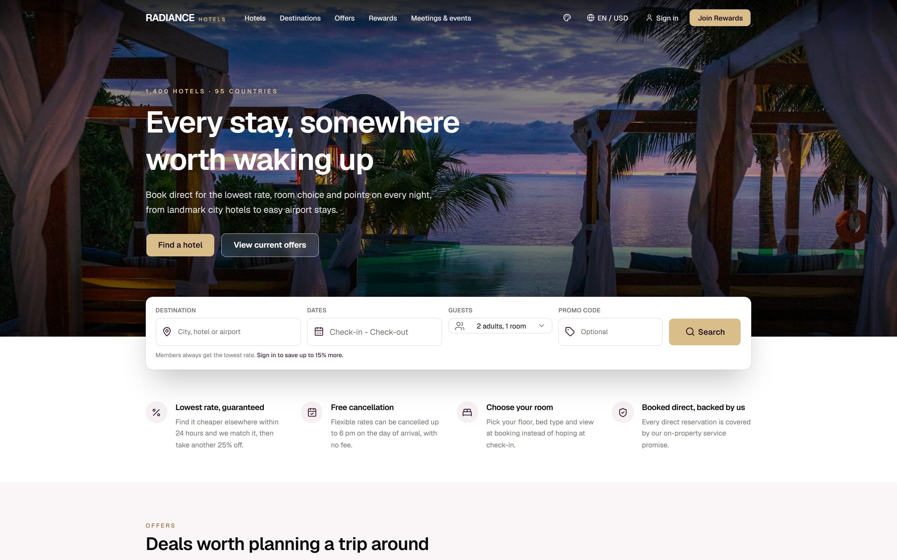
Radiance Hotels is a demonstration build. The business is invented, which is exactly why we can show you every page and explain every decision. It is built and deployed to the same standard as client work — open the live demo and click through it.
The brief
Radiance is a demonstration build for a hotel group — 1,400 properties across 95 countries, four sub-brands, and a loyalty programme. Every hotel group has the same commercial problem, and the website is the main lever against it.
Three people, three different jobs
Almost every failed site in this sector fails by treating these visitors as one audience.
The comparison shopper
They found you on an OTA and opened your site in a second tab to check whether direct is cheaper. You have about ten seconds to answer.
The returning guest
They already know the brand and want to book the same thing again quickly, with their points.
The corporate and events booker
Meeting space, capacities and a human to talk to. Small in number, large in value.
Decisions we made
Every one of these is a choice that could have gone the other way, and a reason it did not.
The booking widget is the page
Destination, dates, guests and promo code sit in a card overlapping the hero, visible without scrolling. Every extra click between arrival and a date picker is measurable lost revenue for a hotel.
The rate-parity argument comes before the marketing
Four guarantees sit immediately under the fold: lowest rate matched plus another 25% off, free cancellation until 6pm on arrival day, pick your own room at booking, and a direct-booking service promise. That is the whole case against the OTA, made on the first screen.
Member pricing is stated, not hidden behind a login
"Members always get the lowest rate. Sign in to save up to 15% more" sits inside the search card. The loyalty programme is a booking-conversion tool, so it argues at the point of booking rather than on its own page.
Offers carry real deadlines
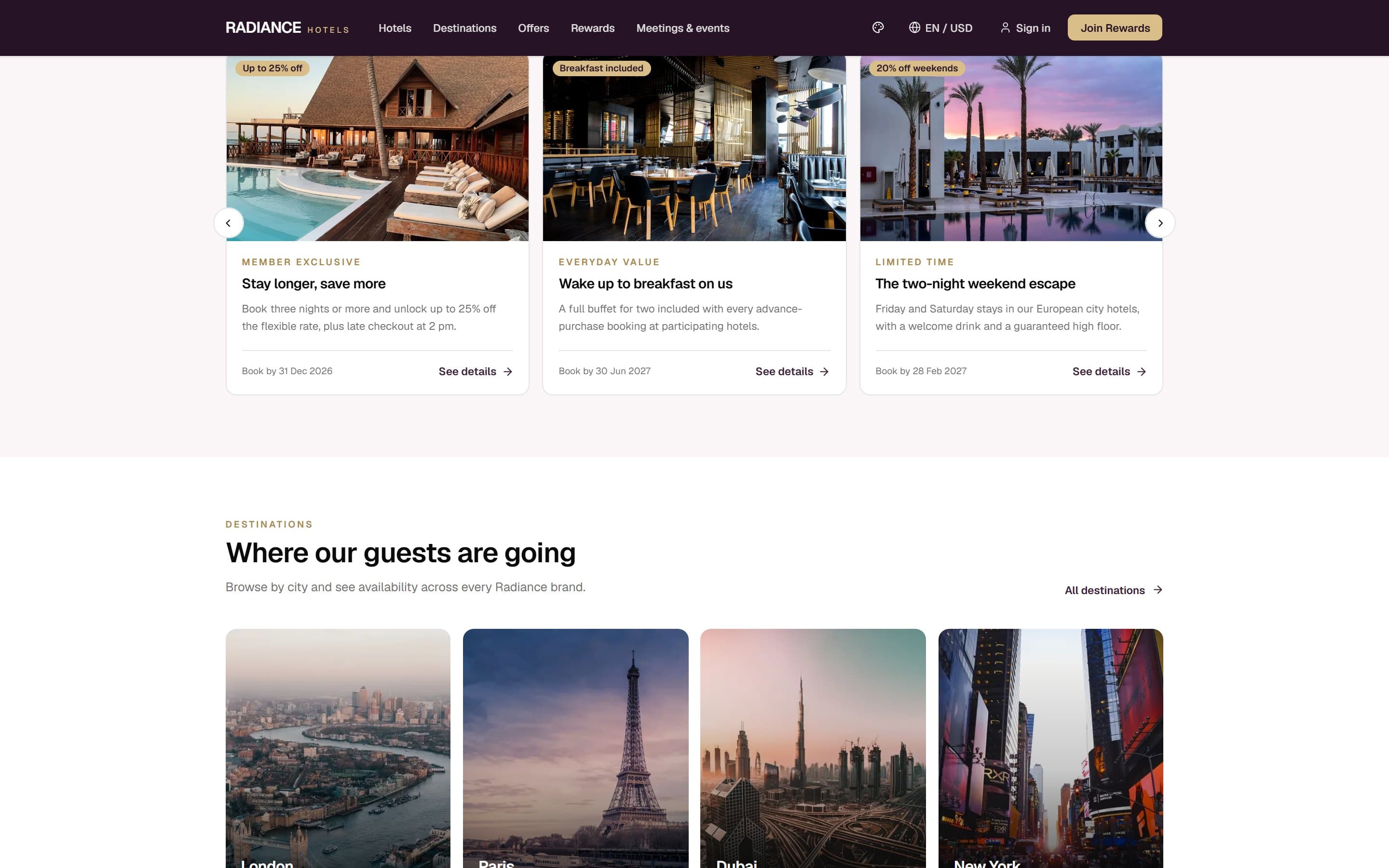
Each package shows its discount, its audience and a book-by date. A dated offer converts; an evergreen "special offers" page does not.
Currency and language switching, because the audience is global
An EN / USD control sits in the header. A guest booking a London hotel from Sydney should not have to do arithmetic — the same reasoning behind the currency switcher on our own pricing page.
Inside the build
Built for the phone first
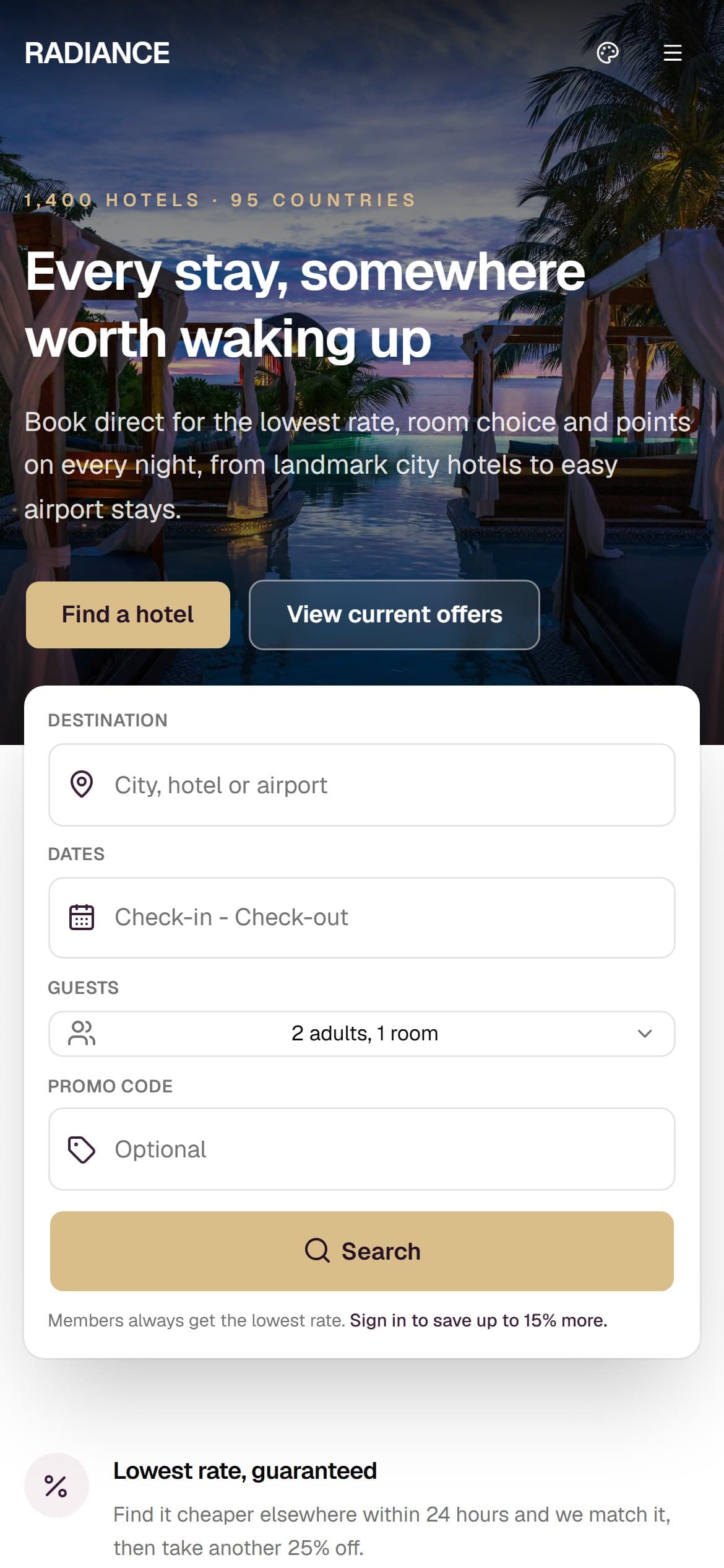
Most visits to a site like this arrive on a phone, and Google indexes the mobile version first. Every layout here is designed at 390px and scaled up, rather than designed on a desktop and squeezed down.
What is in the build
- Availability search: destination, dates, guests, promo code
- Rate-parity and cancellation guarantees above the fold
- Member-rate prompt inside the booking flow
- Dated offers and packages grid
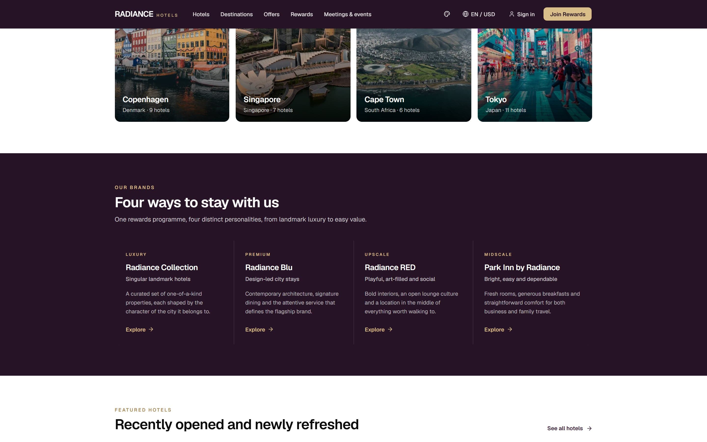
- Destination browsing across eight cities
- Four sub-brands with distinct positioning
- Recently opened and refurbished properties
- Loyalty programme with points on every night
- Meetings and events enquiry path
- Language and currency switching
- Light and dark theme
- Full mobile layout
Built with
- Next.js (App Router)
- React
- Tailwind CSS
- next/image
- Vercel
Mainstream, well-supported technology on purpose. You will never be stuck with software only we can maintain.
Other case studies
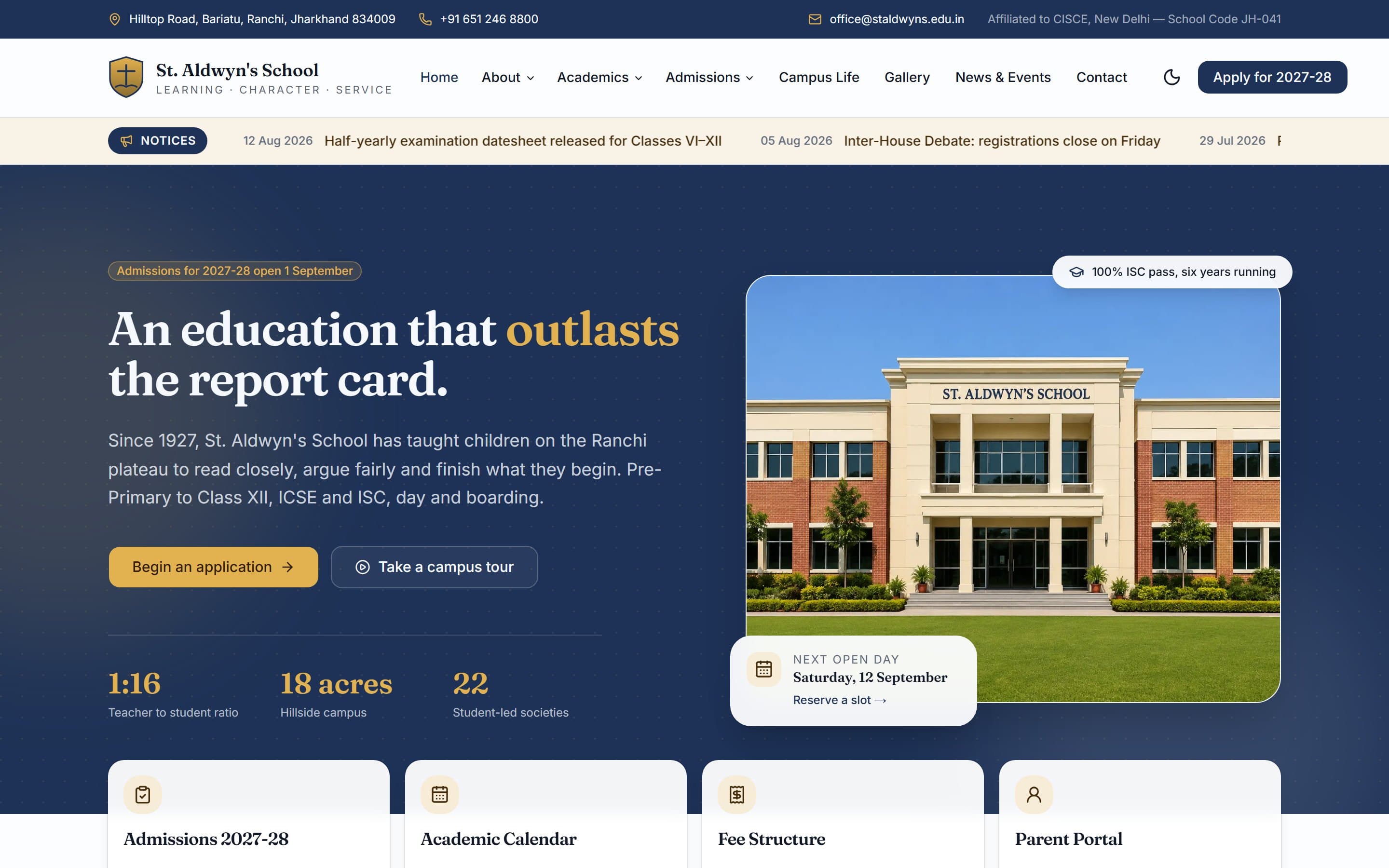
St. Aldwyn's School
A day-and-boarding school site built around one job: turning a parent browsing at 10pm into a booked campus visit.
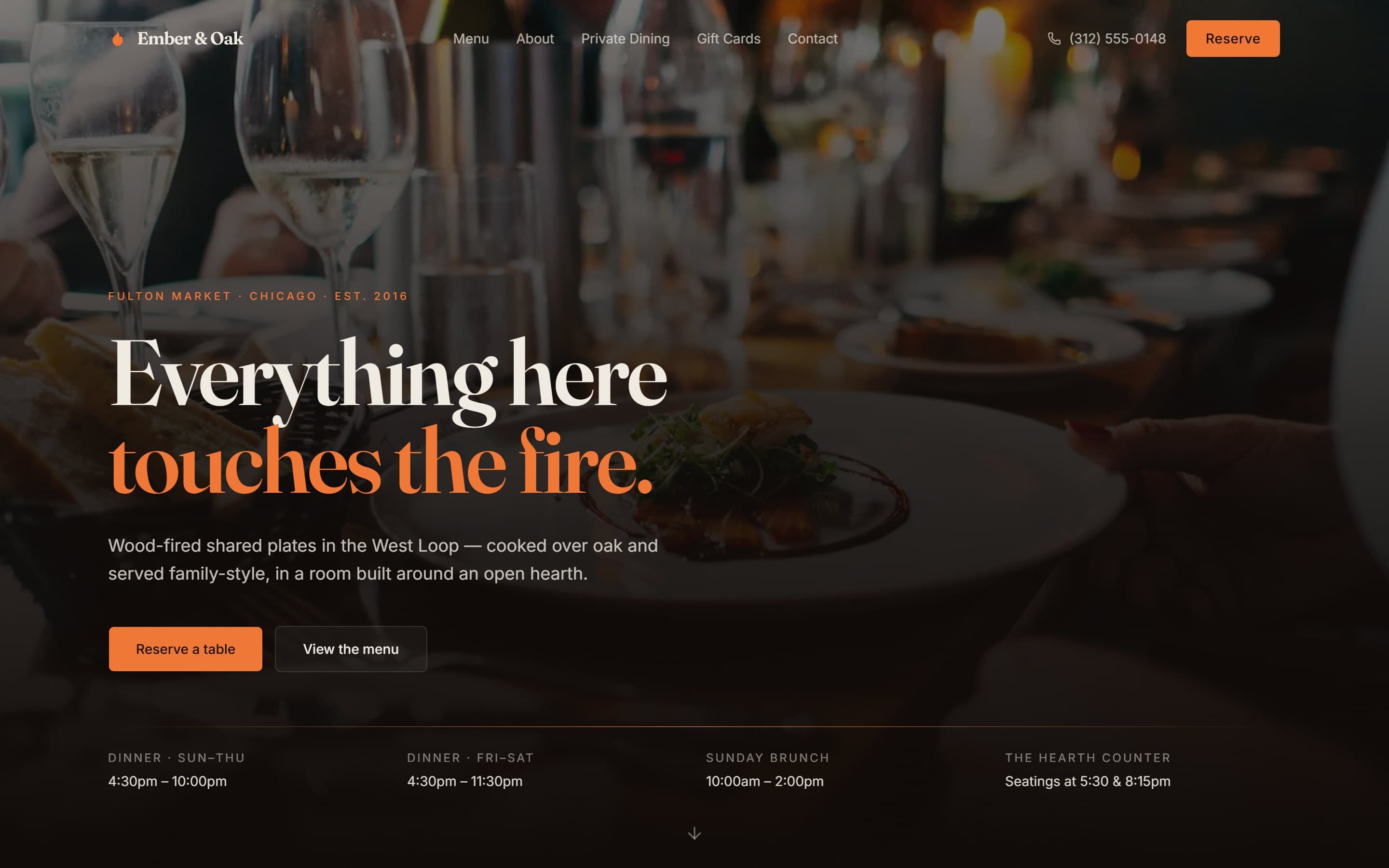
Ember & Oak
A wood-fired Chicago restaurant site designed around the three things a hungry person actually needs in under ten seconds.
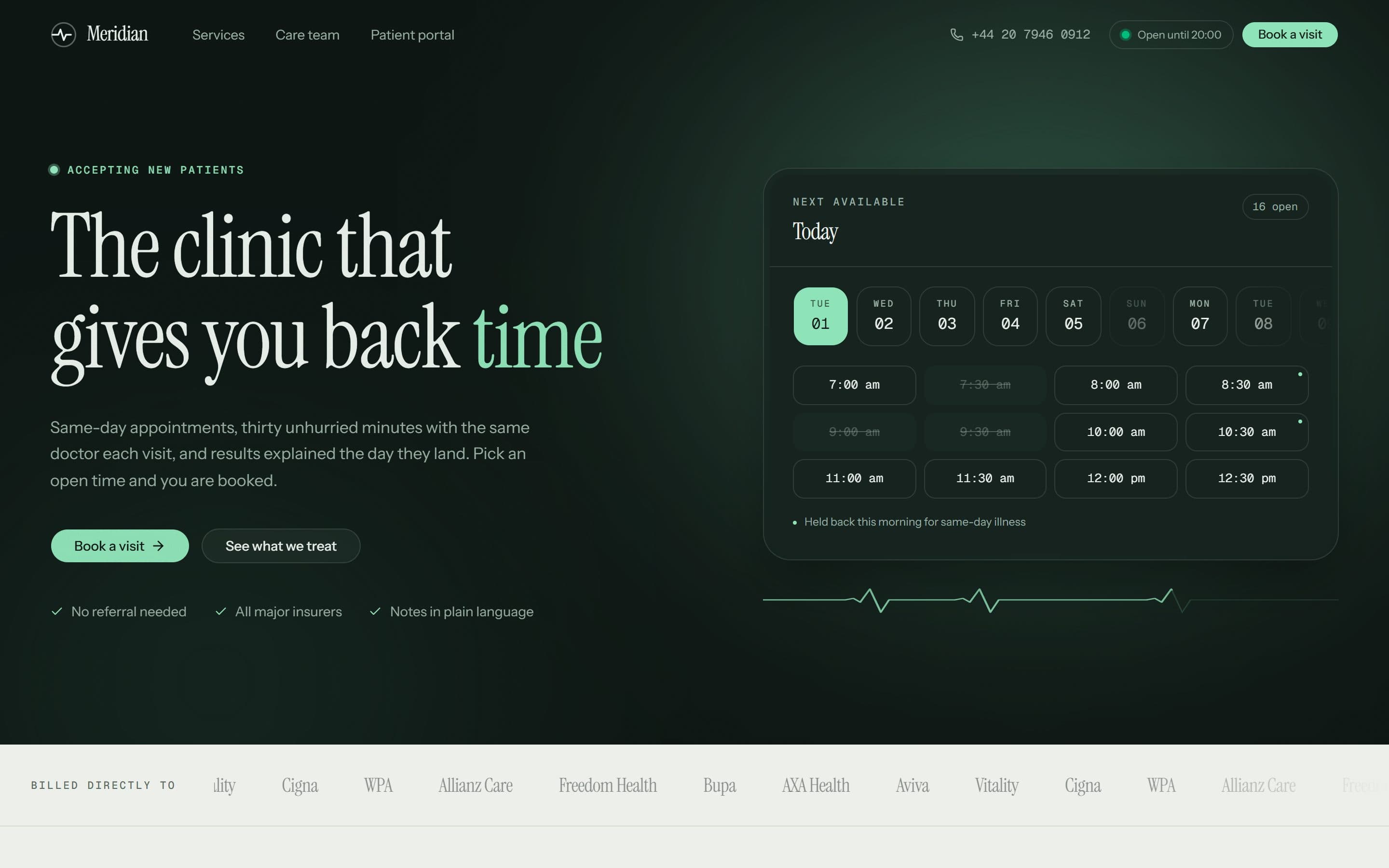
Meridian Clinic
A London private GP practice whose homepage opens on real, bookable time slots instead of a stock photograph of a stethoscope.
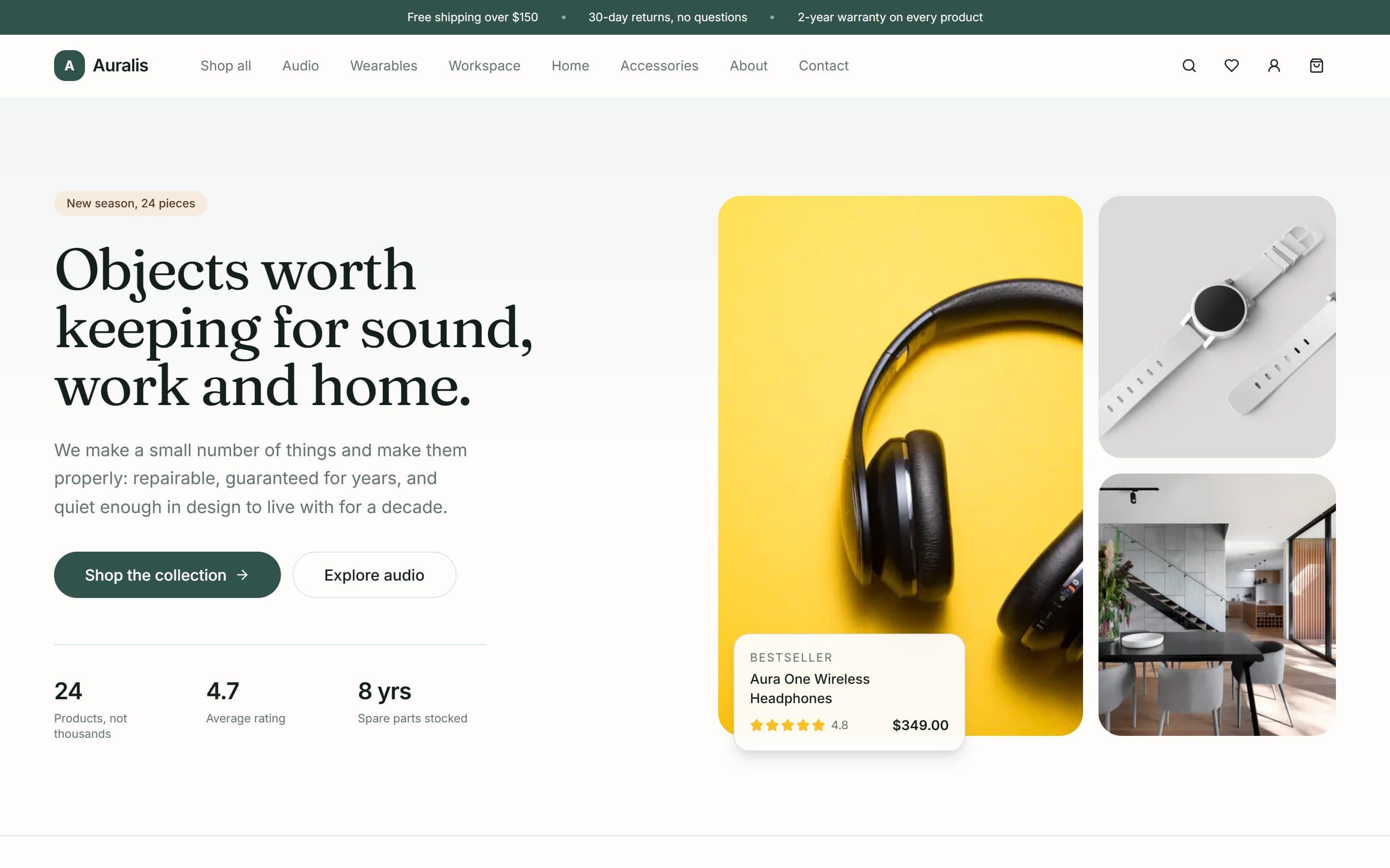
Auralis
A twenty-four product shop for audio, workspace and home goods, built around a deliberately small catalogue and a repair-rather-than-replace promise.
Want something like this?
A free 15-minute call, booked in your timezone, is enough for us to send a fixed written quote.
