
Restaurant websites have the shortest patience budget of anything we build. Nobody browses a restaurant site. They open it because they are hungry, usually on a phone, usually within an hour of eating, and usually while holding two other tabs open for the places down the street.
That single fact should decide the entire design, and on most restaurant sites it decides nothing at all. What you get instead is a full-screen video, an autoplaying slideshow of plated food, a paragraph about the chef's philosophy, and the opening hours somewhere in the footer in eleven-pixel grey.
We recently built Ember and Oak, a demonstration site for a wood-fired restaurant in Chicago, specifically to work through this problem. What follows is the reasoning, which applies whether you run a forty-cover neighbourhood place or a group of them.
The three questions, in order
Every visitor to a restaurant website is asking some subset of three questions, and they are almost always in this order:
- Are you open? Right now, or at the time I want to come.
- What is the food, and roughly what does it cost?
- Can I get a table?
If your homepage answers all three without a scroll, you have done the job. Most sites answer none of them above the fold.
Hours belong on the first screen, in full
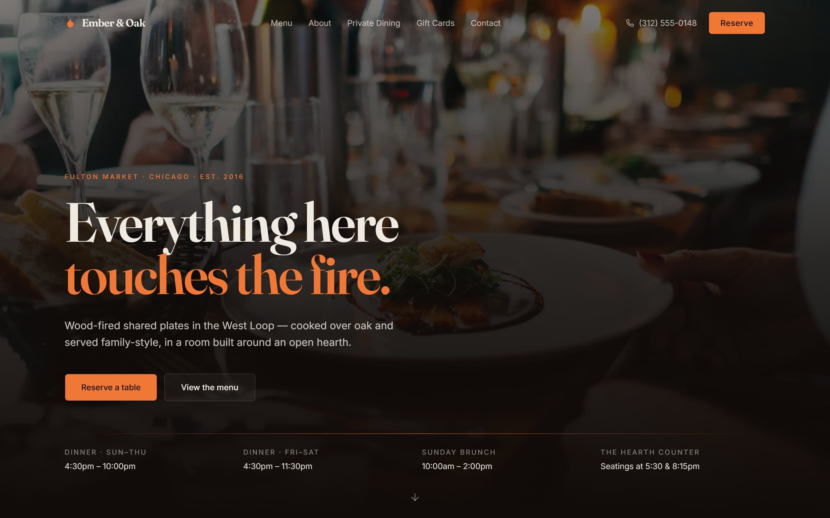
Not "see our hours". Not a link to a contact page. The actual hours, laid out, including the ones that differ. On the Ember and Oak build there are four columns under the hero: dinner Sunday to Thursday, dinner Friday and Saturday, Sunday brunch, and the two seatings at the hearth counter. A visitor can read all of it in a second and a half.
This matters more than almost anything else on the site, because "is it open" is the single most common reason a restaurant website gets opened at all. Burying that in a footer to protect the visual impact of a hero image is trading your most common use case for your least important one.
The menu must be text, not a PDF
This is the most common serious mistake in the category, and it is worth being blunt about why.
A PDF menu is unreadable on a phone. The visitor gets a document zoomed to fit a 390-pixel screen, has to pinch and drag around it, and gives up. It is also effectively invisible to Google: search engines index PDFs poorly, so none of your dish names, none of your ingredients, and none of the terms people actually search for ever make it into search results. And a PDF cannot be updated by your floor manager on a Tuesday afternoon, which is why so many restaurant sites are advertising last winter's menu in June.
Put the menu on the page as real text. On the demo we show six signature dishes with descriptions and a wine list, with a link through to the full menu. That is enough to answer "what is the food like" without turning the homepage into a menu board.
Reserve has to be permanent
Booking is the only conversion a restaurant website has. On the demo build, a Reserve button sits in the header at every scroll position, with the phone number next to it, because a meaningful share of people — particularly for larger groups and older diners — would still rather call.
If you use OpenTable, Resy, SevenRooms or Tock, the button should open the widget directly rather than sending people to a separate page that then sends them somewhere else. Every intermediate screen loses people.
What actually earns its place after that
Once the three questions are answered, the rest of the page is doing a different job: convincing someone that this is a place worth choosing over the alternative. Two things do that work far better than copy does.
Photography of the room, not just the food
Everyone photographs the food. Fewer people photograph the room, and the room is what a diner is actually choosing when they pick between three restaurants with similar menus. Is it loud? Is it a date place? Could I bring my parents? A handful of honest interior photographs answer questions that no amount of writing will.
Press and awards, positioned where the decision happens
Social proof works at the point of decision, not on a separate page nobody visits. On the demo, press quotes scroll past in a band directly under the hero. If a local paper has reviewed you, if you have an award, if you have a rating worth showing, it belongs in the first screen and not on a "Press" page in the navigation.
Things you can safely skip
Restaurant sites accumulate features that nobody uses. In our experience these are almost always dead weight:
- An autoplaying background video. Expensive, slow on mobile data, and it delays the content people came for.
- A long chef biography on the homepage. Worth having on an About page. It is not a reason anyone books.
- A blog nobody updates. An abandoned blog with three posts from two years ago actively signals neglect.
- A photo gallery with sixty images. Eight good ones beat sixty average ones, and load far faster.
- A newsletter popup that fires on arrival. Ask after they have found what they came for, not before.
The mobile point, stated properly
Well over half of all web traffic is mobile, and for restaurants specifically it is higher still, because the use case is inherently on-the-move. Google also indexes the mobile version of your site first, which means the mobile version effectively is your site as far as search is concerned.
This is why we design these layouts at 390 pixels and scale them up, rather than designing on a desktop and squeezing them down. The difference shows in the details: tap targets big enough for a thumb, a phone number that dials when tapped, an address that opens the map app, and hours you can read without zooming.
A reasonable scope, and what it costs
A restaurant site does not need to be a large project. The useful version is typically:
- Home, with hours, reservations and signature dishes
- Full menu as text
- About, with photographs of the room
- Private dining or events enquiry, if relevant
- Contact, with map and directions
That is a Starter or Business build for us — from $250 to around $750 depending on how much custom design the brand needs, and one to three weeks. Gift cards, online ordering or a loyalty integration push it higher.
Try it yourself
The build described here is live and you can click through it: Ember and Oak. Open it on your phone, which is how it is meant to be judged, and see how long it takes you to find the hours, the menu and the reservation button. Then do the same with your own site.
If the second test goes worse than the first, tell us about your restaurant and we will come back with a fixed written quote.
